How ME Bank compete through digital
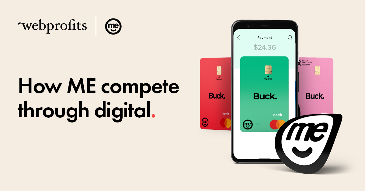
Have you heard of ME? They’re a bank.
Founded in 1994 and originally named Super Member Home Loans ( it was founded by industry superannuation funds); it was later renamed Members Equity Bank and then ME Bank, before settling on ME in 2015.
They were one of the first non-bank lenders to emerge in Australia and their primary focus was to provide home loans to the members of Australian Super Funds.
At the end of FY 2020, they reported an astounding $31.5billion worth of assets under management, and more than 550,000 customers – growth of more than 7% compared to FY 2019 numbers – under tumultuous and unprecedented conditions.
And in February 2021, they were acquired by Bank of Queensland for $1.33billion.
Now, ME may not be too great at customer comms, but it’s their digital marketing that has got our interest. In this article, I’ve broken down how ME uses digital marketing to drive that customer growth and what makes them such an attractive and valuable asset to a more traditional bank.
Firstly, they pick their battles
ME offers a range of products and services that you would expect from a bank. Home loans, term deposits, savings accounts, personal loans, credit cards…
And their $31.5billion worth of assets while sizable pales in comparison to some of their competitors:
Commonwealth Bank – $1,0146billion
Westpac – A$907billion
ANZ – $981billion
NAB – $807billion
Those assets, including home loan portfolios and customer deposits, help to generate significantly higher revenue, which allows them to spend significantly more on their marketing.
So how do they continue to grow when their competitors have much deeper pockets?
They do fewer things, but do them better
If we take a look at SEMRush we can see that they used to typically bid on thousands of different keywords, especially +5 years ago.
Not only were they bidding on thousands of keywords, but they were only in the top 3 ad positions for a handful of them. More often than not they were between positions 4-9 and occasionally even lower than that.
After scaling back on paid search for a couple of years, they came back strong in 2020, targeting a fraction of historical enquiries and vying for the top three positions for most of those keywords.
It would stand to reason that they’re now generating less traffic, right?
Wrong.
Despite bidding on a fraction of the keywords that they used to, they are now generating 2x – 3x times the amount of traffic.
They’re focusing on the keywords that actually matter, the ones that move the needle.
It’s not just that they’re bidding on fewer keywords now, they will also be monitoring fewer keywords. They’ll be spending less time optimising and tweaking those keywords, their respective ad groups, and ad variations too.
That frees them up to spend more time on the keywords that matter, or on other marketing activities.
They focus on the products that matter
ME highlights 6 different products on the home page of their website…
But if you breakdown the keywords they’re bidding on you’ll see that only one is really promoted through Google Ads
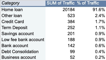
Click here to see the SEMRush estimate of all the keywords they’re currently bidding on
More than 90% of the traffic they get from Google Ads seems to come from keywords around home loans.
Given that home loans were their main product when they launched 30 years ago, it makes sense that it’s the one they promote the most now.
It’s the one they’re known for, it’s the one they’ve had the longest time to work on, and it’s one where they are comfortable that they understand their customer.
In fact, home loans are such an important product that they get highlighted in the company’s end-of-year financial summary to indicate the business’ success.
For example,
“In the hyper-competitive home loan market in the second half of the year, new business slowed, and we experienced outflows as a result of the ultra-low rates and large cash-backs being offered by some competitors. We made the decision to pursue profitable growth in this segment in order to maintain net interest margin and focus on longer-term, sustainable home loan growth.”
ME knows that they can compete with the big players on home loans, so that’s where they aim to win customers.
Once they’ve acquired the customer, they have captured their email address, phone number, and even their home address. They also collect information about their financial situations and other lifestyle choices, which makes it a lot easier to cross-sell them other products.
Acquiring a new customer can cost anywhere from five to 25 times more than retaining a new one, so when your competitors have the budgets to bully you out of the market it’s a very wise move to focus on what you can, and then expand out.
In the B2B world, this is known as a land & expand strategy, but it looks like ME applies it here in the B2C space.
They bid higher up the funnel
Even though ME are focusing their efforts on competing for home loans, it doesn’t mean they have the financial might to go toe-to-toe with the big 4 banks.
The most expensive keywords on Google Ads are usually the ones that indicate the user is further along through their purchasing journey and likely to make a decision soon.
For example, bidding for “home loan brokers’ costs ME an estimated $13.83 per click. People searching for this term have probably decided they’re getting a home loan and want to speak to someone.
Even keywords containing a brand name aren’t cheap when they’re further down the funnel, ME pay an estimated $12.88 each time someone clicks their ad for “ME home loans”
Keywords like that make up a relatively small proportion of ME’s keyword portfolio, however.
The keyword that sends the most traffic to their site?
Home loan calculator
That keyword alone drives an estimated 19% of their paid search traffic, and it only costs $2.57 per click!
Keywords containing the word “calculate” or “calculator” deliver 69% of ME’s paid search traffic … that’s huge!
Not only that, they only cost $1.6 per click on average, compared to the rest of the keywords that cost an average of $6.
It’s not just a standard home loan calculator though. They also have one to calculate borrowing power, stamp duty, and refinancing costs.
So they’re not just targeting customers looking for home loans, they’re trying to capture them early in the journey so that they don’t need to pay as much.
Then what happens?
They provide value higher up the funnel and then follow up to convert
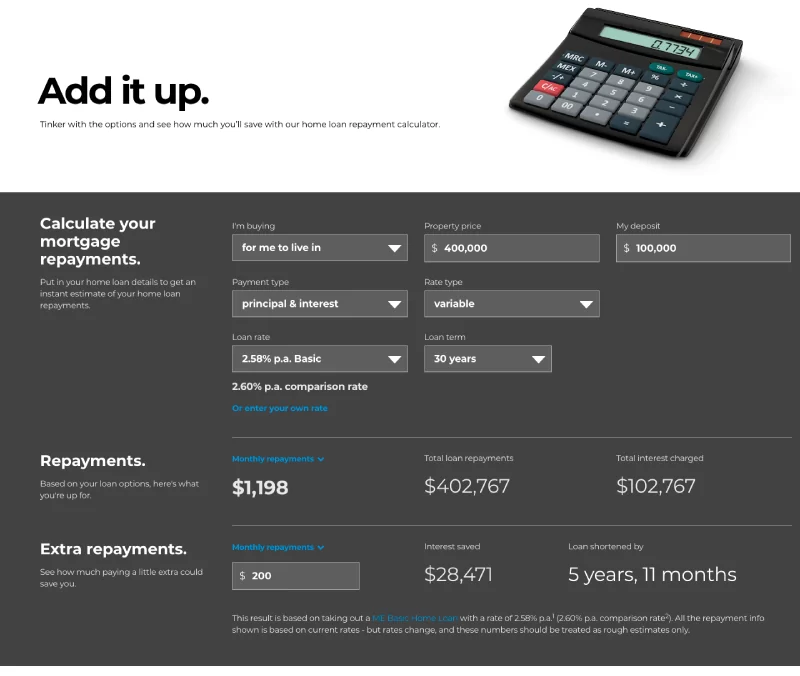
The calculators they have on their site are really simple and easy to use.
In just a few clicks a user can see how much their repayments will cost if they got a home loan through ME. And given they’re competitive on home loans, they expect to convert a decent number of these visits into enquiries.
However, if they don’t convert then, they still have several options.
Now that the user has landed on their site and shown their interest in home loans, ME can target them in multiple other ways.
As an example, they could run remarketing ads on the Google Display Network or on Facebook in order to provide the visitor with more information, encouraging them to come back and complete the transaction (or at least take the next step).
Strangely, ME doesn’t seem to be doing this on either platform.
Another alternative would be to run Remarketing Lists for Search Ads (RLSA).
These are search ads that only show to people who have visited your site when they search for the keywords you specify.
Without going into ME’s Google Ads account it’s impossible to say whether they are running these ads, but it would make sense for them to do so.
They can then run ads for more expensive search terms but, in theory, they have a head start on their competitors as the person searching has already interacted with them.
This prior interaction makes it more likely that they will convert with ME.
Key Takeaway: When it comes to paid search, ME focuses their attention on their most successful product – home loans. They also specifically aim higher up the funnel where the keywords are cheaper, and then they can nurture the prospect towards becoming a customer. Once they turn them into a customer, they will have plenty more opportunities to sell other products and services.
Note: This is the same approach Webprofits drive and recommend as part of their Digital Growth Framework. Validate with one product and get the most out of it before integrating other products/services into your marketing mix.
ME go hard on brand advertising
Search is an incredibly competitive channel for the banking sector.
We’ve already seen how the budgets of the big 4 banks compare to ME, but they’re not the only players in the game.
For starters, there are other banks like ING and Suncorp, but ME also competes against other neo-banks like Lendi, Ubank, and others.
As if that wasn’t enough, they also have to contend against aggregators like Finder, CANSTAR, Compare the Market, and others. These guys in particular are great at digital as they only receive a commission. That lower revenue per transaction drives a need for constant optimisation of their digital campaigns to acquire as many leads as they can for as low a cost as they can.
That’s a lot of businesses vying for the same search terms, and it limits how much success ME can have in the channel.
There’s so much competition that ME doesn’t appear organically in search engines for the same terms they bid on.
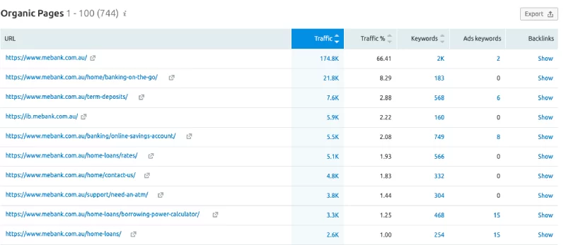
Using SEMRush, we can see the top 10 pages that receive organic traffic.
Only one calculator page appears in the top 10, and it’s not the same one that drives 19% of their paid traffic.
This tells us that ME can afford to pay to capture people searching for calculators, but can’t seem to compete when it comes to organic search for the same terms.
In order to get around that, ME has come up with an alternative way to drive business.
Rather than capture people searching for home loans, they build demand for their brand instead. That way when someone wants a banking product, they search for ME instead of for “home loan providers”.
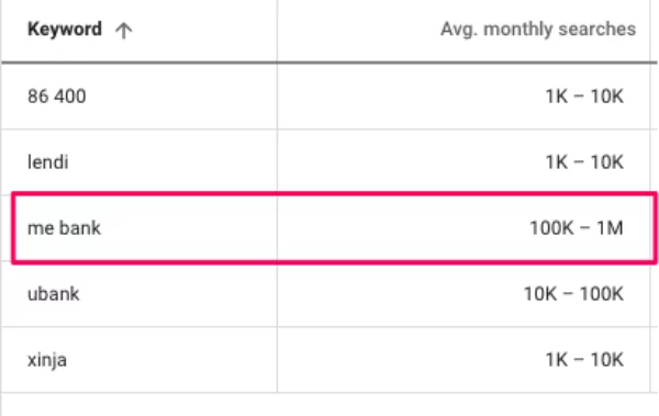
Don’t believe me? Check out the search volume for some of the biggest non-bank lenders…
So, what does ME do to drive 10x more brand interest than its competitors?
They run TV-style ads on YouTube
The ads that ME run on YouTube are reminiscent of the ads they run on television. Here’s an example:
The ad is short and punchy, but gets all the important information across:
- We deal with home loans (again, focusing on where they perform best)
- Break the bad spell with your current lender and switch (a clear call to action)
- Get our award-winning home loan at a low rate (a reason to switch)
It’s only 15 seconds long, so it’s designed to reach as many relevant people as possible.
These ads are likely to run in front of affinity audiences – e.g. people who are likely to be in the market for a new home (and a loan to go with it) in the near future. They could also work as remarketing ads to people who have visited the site or to existing customers.
Here’s another example of a branded ad of theirs on YouTube:
This one is more quirky, which makes it easier to remember; showcasing ME’s 25-year track record of helping Australians achieve their money goals and their support for ‘good’.
The aim of these ads isn’t to drive immediate traffic. It’s to stay in the mind of the viewer, build positive brand association, for them to come back and search for later; and I believe it works.
They produce PR-worthy content
Another way to get your brand in front of a lot of potential customers is to get someone else to do the talking for you – you just need to give them something to talk about.
They create industry reports
In the wake of the Royal Commission into Banking and Financial Services, ME produced a report that found 94% of Australians don’t trust their bank. 95% found bank products and rates weren’t transparent, and 92% believed banks sell products and services that they don’t need!
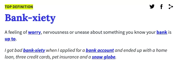
ME built a significant marketing campaign off the back of this report, centred around a term they created: “Bank-xiety”
Reports like this take time, money, and a lot of effort to put together, so it’s not surprising to see ME made the most of it and repurposed it in a number of ways.
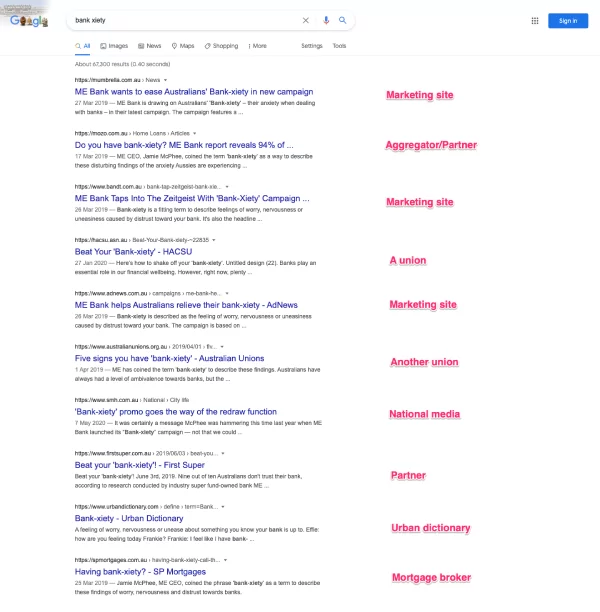
For starters, just have a look at the different types of websites that posted about it.
Two years on, and the sites that rank include a nationwide news website, multiple marketing websites, unions, and even Urban Dictionary!
That’s right, they went to the effort of creating an Urban Dictionary entry for the word they created
Though none of the material is still available, they also reportedly created ads for
- TV
- Radio
- Out of Home
- Display, and
- Social media
They weren’t just any old Social Media ads, though. According to Mumbrella
A mediation ad will appear on Facebook feeds, encouraging users to “take a deep breath with ME”.
ME even leveraged influencers by sending them a pack that included bank-xiety pills (M&Ms), a stress ball, and a burner phone to a bank-xiety hotline playing calming music.
Those are a lot of very creative ways to repurpose an industry report!
They jump on trending topics
Cast your mind back a few years – do you remember when Slow TV was briefly popular?
People would, apparently, watch seemingly nothing happen on a screen for hours on end. For example, SBS broadcasted 17 hours of the train journey, The Ghan
It’s true. That actually happened. And people watched it. ME saw an opportunity to get involved and ride the wave of popularity that Slow TV was enjoying.
They created and posted a one hour video of a credit card being handcrafted.
Judging by the comments, people liked it!
Slow TV is still a thing, but I don’t think it’s as popular as some people thought it might be.
But what this campaign shows is ME’s willingness to experiment with different and interesting ways to get their name out there, and differentiate themselves from competitors in what is typically a stale and homogenous industry.
Key Takeaway: Given their industry is competitive for search (and other channels), ME promotes their brand to become synonymous with banking products and have customers search for them directly. They do this by repurposing TV ads for YouTube, and creating epic pieces of content that get PR attention and are repurposed for other channels.
Note: I wouldn’t recommend taking this approach until other performance-based growth channels are implemented and optimised. Branding plays like this would usually be reserved for businesses who have reached the Amplification stage of our Growth Framework.
They keep their website simple
We’ve looked at how ME promotes themselves at the top of the funnel to drive people to their website, now let’s see what they do at the pointy end of the funnel to convert them.
As a “digital bank” you would expect ME to have a good website, and you’d be right.
One of the things that makes it good is that it looks like it’s been designed for mobile-first. With mobile making up around 50% of website traffic both worldwide and in Australia, a significant portion of their own traffic is likely from mobile.
And if designed right, a mobile-first website will look good on a desktop screen, so it makes sense to go mobile-first these days.
With that in mind, the following analysis of their site will focus primarily on the mobile version.
They don’t clutter the homepage
ME’s homepage is basically just a gateway to the rest of their website.
They don’t immediately try to sell to their visitors or push products down their throat, they just make it easy for the visitor to find what they’re looking for.
This is likely a result of the fact that so much of their traffic comes from brand search terms. If the visitor already knows about your brand, then you don’t need to spend as much time educating them on why you’re the right choice for them.
Let’s take a look at the different sections of their home page (spoiler alert: there aren’t very many!)
They funnel people towards search
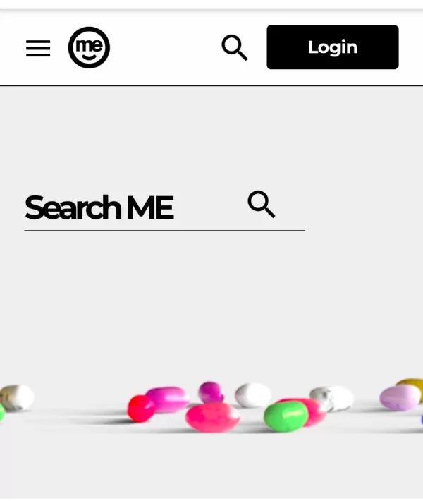
This is the header on ME’s website
That’s it. There’s literally nothing but a search box.
This is pretty unorthodox for a banking website, and not usually something I would recommend for a site that has a relatively small number of products.
Nobody wants to scroll through a website clicking around links to find what they want. By putting search front and centre at the top of the site allows the user to find the information they’re looking for quickly.
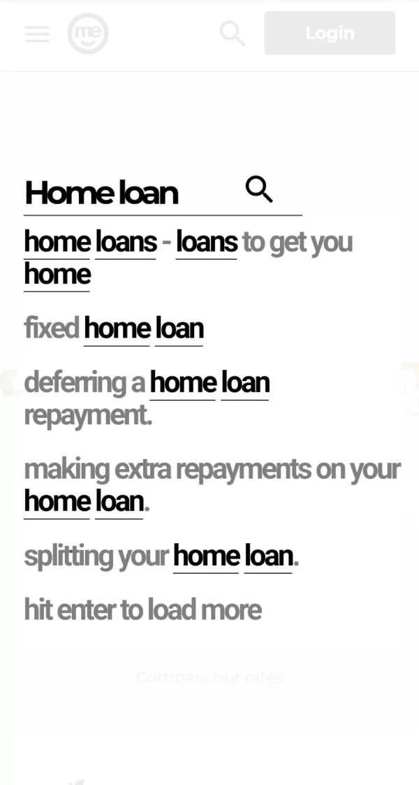
For example, searching for “home loan” brings up results for products as well as some of the most popular articles or search terms around the topic.
It makes sense. Why waste the user’s time clicking around the site, especially on mobile where it feels more onerous, when they can just search instead?
They don’t oversell their products
As already mentioned, a significant portion of ME’s traffic comes as a result of their brand activity.
Visitors already know they have low rates and award-winning accounts, so they’re not using the home page to “sell” their products.
They can sum up each of their products in a one-sentence call to action
What I love most about this section is how it sells the benefits and not the features.
“Move in sooner”
“Shop without aftershock”
“Take control of debt”
These really simple sentences are all the visitor needs to click through to the next part of the site.
They don’t bamboozle people with rates, returns, and figures for 6 different products on one page.
Just pick the product you want to know more about, and then you can go into the ‘details’ to figure out if you want it or not.
They let customers know what’s going on with the business
A lot of the people visiting ME’s website are going to be their existing customers wanting to sign in to check their accounts and potentially look for other products.
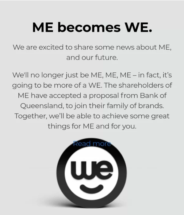
ME let them know about the recent acquisition on the home page.
It’s not a huge growth lever, but keeping your customers up to date with what’s going on in your business can help retention.
I do have to dock them points* for poor design on this section, as the read more link is almost hidden by the logo.
*All points are fictitious and do not play a part in this analysis
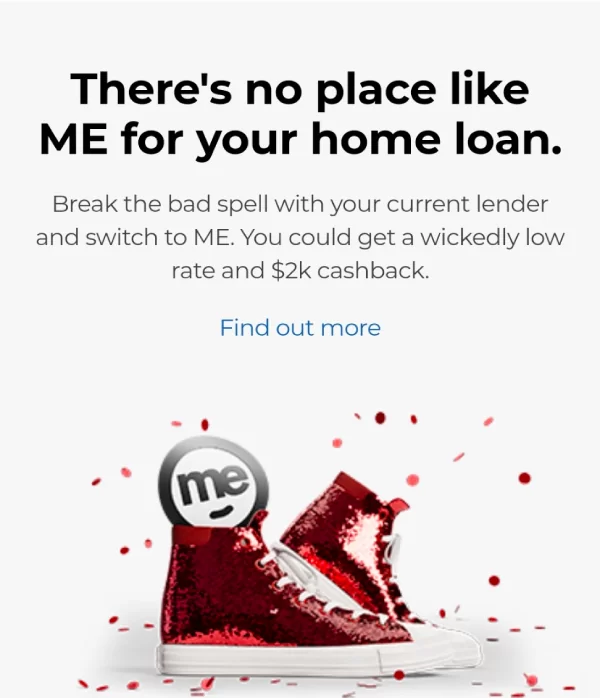
They promote campaign offers
ME is currently running an offer to give their new customers $2,000 cashback if and when they switch their home loan provider.
Once again, the section is super simple.
They’re not overloading the section with information, it’s just enough to pique the visitor’s interest, and then they can choose to find out more.
If it were me, I would have this higher up the page (potentially in the header image) but with a high number of existing customers visiting the site I can understand why it would be this far down.
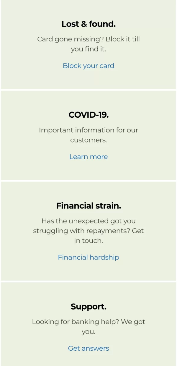
They highlight popular and topical support content
A lot of their visitors are likely coming to the site for support.
If for some reason they don’t use the search function at the top, then ME highlights some important sections on their homepage.
In most businesses, the Pareto Principle (or 80/20 rule) applies.
Having the most common support sections highlighted on the home page probably helps provide information to 80% of the visitors looking for support.
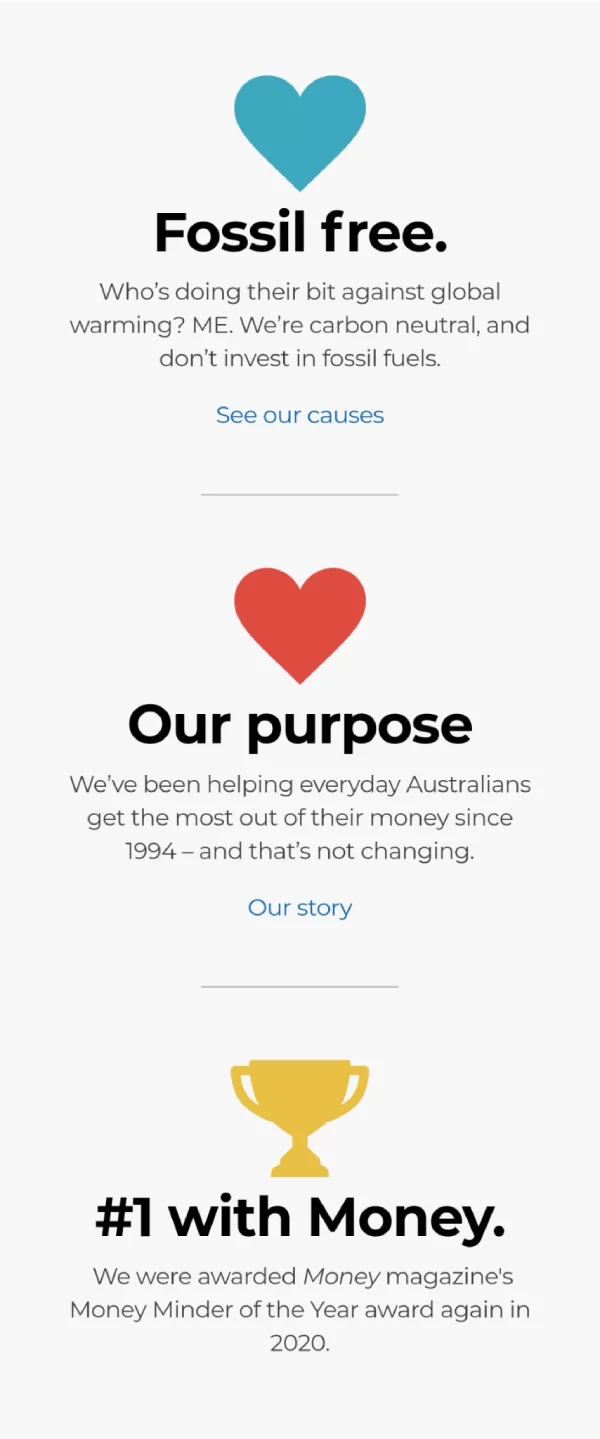
They highlight their values
The final section of the homepage talks about ME’s values as a business and the causes they support.
Once again, they keep it subtle.
They’re not preaching about them from a soapbox. They give you a little bit of information, and then the opportunity to find out more.
And that’s it, that’s the home page.
Six very simple, clean sections that are designed to help the visitor find what they’re looking for.
Their product pages provide value
Making a decision on something like a home loan is a big deal.
For most people, it’s the biggest transaction they will undertake and so there are a lot of factors to consider before moving ahead.
ME helps make it easier by providing content in various forms so the visitor can make an informed decision.
Let’s take a look at their product page for home loans as an example.
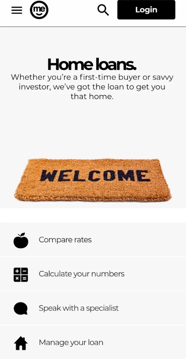
The navigation buttons accommodate for different stages of the journey
ME recognise that people visiting their product page could be at various points of the customer journey, and so they provide different navigation paths accordingly.
If someone knows what they need to about home loans, they can go straight to comparing rates to find the product that’s right for them.
If it’s still early days and they want to calculate their numbers to get a better understanding of what the loan is going to cost them, then they have the option of using a calculator.
Rather speak to someone? ME provides a number of ways to get in touch with a specialist.
And lastly, they have a section to help customers who already have a home loan and want to manage it better.
All of this before I’ve even scrolled down to see what’s next on the page.
It all helps the user find what they’re looking for as quickly as possible.
They highlight offers early
Unlike the homepage which had it further down the page, offers come up much sooner on the home loans page.
Given it’s a product page, it’s safe to assume that the majority of people visiting the page are looking for a loan, so it makes sense to bring the offer higher up.
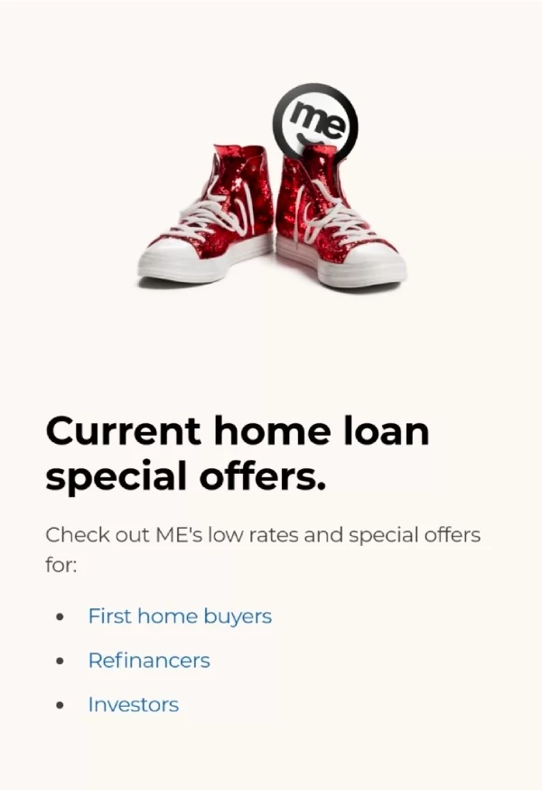
Although there are three offers, they don’t overcomplicate it with three sections or three images.
It’s simple – they have three great offers, here’s who they are for. Click on the one that is most relevant to you.
Their interactive content is optimised for mobile
Interactive content like calculators are a great way to get a user to engage on your site and to display relevant information in different ways.
But too often sites neglect to take into account the device that users are on.
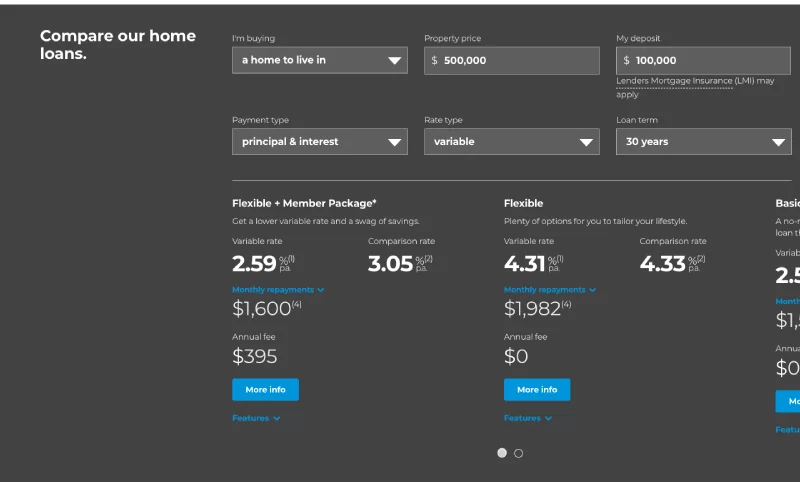
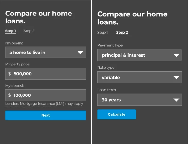
ME’s rate comparison tool has a slightly different user interface for desktop vs mobile users.
On desktops where there’s a lot more space, they have all the options and information on one screen.
Imagine how messy it would look if you tried to put all that on one mobile page!
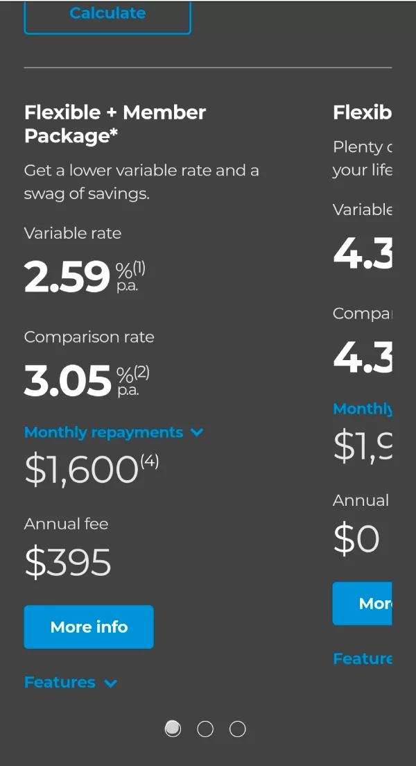
Instead, they break it out into a multi-step process
As well as a great interface, it’s a clean way to display the relevant information.
The little blurb at the top that explains each package is also a big help in deciding which option is right for the customer.
The breakdown their content from a customer’s point of view
As you’d expect, ME has a plethora of articles and pages to find out more about home loans (and other products).
One thing they do really well is position that content from a customer’s point of view instead of their own.
It’s Copywriting 101, but it makes a difference.
From here, the customer can identify the situation they are in and then click through to find the relevant content.
They offer multiple ways to get in touch
Don’t you find it frustrating when there’s only one option for contacting a business?
(Or worse still, they direct you to a hub of content and give you no option for contacting them).
Well, ME does the opposite – they let the customer decide how they want to get in touch.
This is especially important for a business like ME who don’t have a physical presence. Unlike other banks, you can’t just pop into a branch to have a conversation with someone who can help you.
Providing a number of different options increases the chances that the potential customer will use one of them to contact the business.
I’m a little surprised that there isn’t an option to email or live chat, but phone calls are better for converting customers. Video calls are even better than phone calls, and there’s no substitute for doing it face to face – so it looks like they have most of their bases covered.
Key Takeaway: ME’s website is mobile optimised and designed to help the visitor find whatever they are looking for quickly. They provide information for every stage of the customer journey, and display it all in a clean format that makes it easy to digest.
Summary and key takeaways
After reviewing their digital growth strategy, it’s easy to see why ME is a good acquisition for Bank of Queensland.
They have been able to compete against industry goliaths by focusing on a few simple paths to growth and doing it exceptionally well.
1. They pick their battles
Although they have a number of different products, they focus their customer acquisition marketing around a small number of them. They keep their Google Ads more or less limited to home loans, a product they’ve sold for more than 30 years and one where they know they can compete. Once they land the customer, they have the opportunity to cross-sell other products.
Key Takeaway: When it comes to paid search, ME focuses their attention on their most successful product … home loans. They also specifically aim higher up the funnel where the keywords are cheaper, and then they can nurture the prospect towards becoming a customer. Once they turn them into a customer, they will have plenty more opportunities to sell other products and services.
2. They go hard on brand marketing
Having smaller pockets than others means it’s hard to compete in some channels like SEO. To get around this, ME spend a lot of resources on promoting their brand in order to drive branded and direct website visitors. Though not something we usually recommend, it works well for ME.
Key Takeaway: Given their industry is competitive for search (and other channels), ME promotes their brand to become synonymous with banking products and have customers search for them directly. They do this by repurposing TV ads for YouTube, and creating epic pieces of content that get PR attention and then are repurposed for other channels.
3. They keep their website simple
Knowing that a lot of the website comes from people who have heard about the brand, they are subtle in their approach to selling. The site is mobile optimised to ensure a great experience, and they try to quickly provide the customer with the information they’re looking for.
Key Takeaway: ME’s website is mobile optimised and designed to help the visitor find whatever they are looking for quickly. They provide information for every stage of the customer journey, and display it all in a clean format that makes it easy to digest.
The marketing future of ME
You would expect that being acquired by the Bank of Queensland opens up more possibilities for ME to compete on different channels and with bigger budgets.
Given their shrewd approach with relatively limited budgets, some of their competitors are clearly in trouble of losing market share.


