How Philips drives D2C sales with digital marketing

Written by: Jacqueline Coombe
Published:
28 Jun 2021
Direct to consumer (D2C) brands have been killing it.
According to a guide by Shopify, ecommerce is expected to account for 6.6% of all CPG sales in 2021, and with D2C accounting for 40% of the sales growth in the sector.
Businesses like Koala, Dollar Shave Club, and Allbirds are all great examples of successful new startups disrupting traditional industries by selling straight to the consumer.
All three were flourishing way before a global pandemic stopped consumers from going into stores and picking up what they wanted – that trend will only continue to rise.
But this is a review of Philips, and Philips isn’t a startup.
If you’re anything like me, then you think of Philips as an electronics company, right?
They sell TVs, headphones, stereos etc, just like they did when we were younger.
But the 130 year old business’ direction and focus changed back in 2011 when they found themselves losing ground to other electronics heavyweights like LG and Samsung.
They evaluated their position in the market, their strengths, their weaknesses, and decided to reposition themselves as a healthcare technology company instead. They sold off their TV, audio and video businesses, and broke away the lighting sector into a separate listed business in order to “make the world healthier and more sustainable through innovation”.
Shortly afterwards they brought in a new Global Head of Digital in Blake Cahill, and embarked on a journey of digital transformation that saw them bring more digital capabilities in house and align their teams in order to drive better results.
He also brought about a greater focus on ecommerce and selling directly to the customer.
This article will aim to show you how Philips have done that by focusing on four key strategies.
- Their website is optimised for ecommerce
- They take the customer on a journey
- They own the search space
- They harness the power of their happy customers
Unless stated otherwise, everything reviewed in this article is based on their actions in Australia. I’ll also be focusing the analysis on their B2C activities.
Want to get all the top level info in 30 seconds? Check out the summary from the end of each section.
Their website is optimised for ecommerce
Sounds obvious, right?
But there’s a big difference between having a website with ecommerce functionality and having a site that is optimised for ecommerce.
Online sales aren’t an afterthought for Philip’s website team – they’re the goal.
Here’s why their website is good.
It’s easy to navigate
This is more or less rule #1 when it comes to building an ecommerce website – you want the visitor to be able to find what they want in as few clicks as possible.
Let’s take a look at some of the ways Philips have done that by analysing their home page.
Their search function works a treat
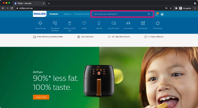
Philips points visitors to all of their top categories and products – and I’ll come back to that soon – but if you really want to make it easy for someone to find what they’re looking for, then make sure the search functionality on your site is good.
For example, let’s search for the airfryer listed on the home page banner
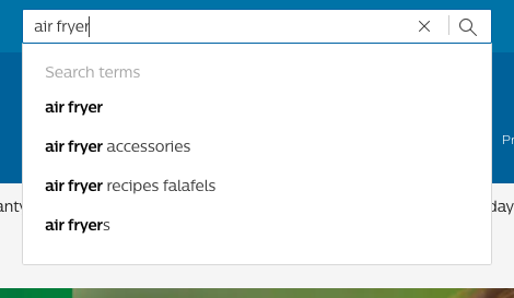
Autocomplete is built into the search bar with (presumably) some of the most popular terms. If you don’t find what you’re looking for in autocomplete, then you can hit enter (or click the magnifying glass) and get taken to a search results page.
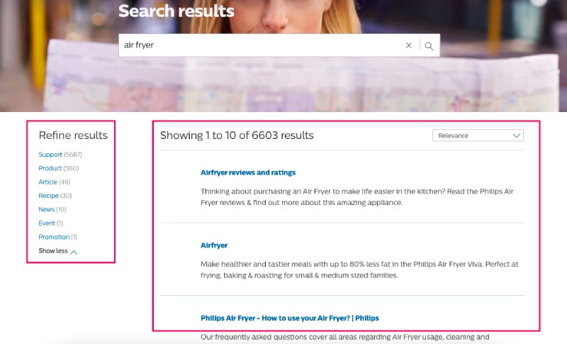
The results listed on the right are sorted by relevance, and I find the selection really interesting.
First and foremost they present the reviews and ratings of their products. They’re not showing you what they want you to know about the product, they’re showing what other people have said. That social proof is paramount to success in ecommerce.
Next up, they list their relevant products, and the third result is an article on how to get the most out of it.
On the left you’ll notice that they’ve categorised the results to make it even easier for you to find the information that you’re looking for.
There’s nothing else on the screen – they’re not trying to sell you anything or promote any other products. It’s just a helpful search page, which is really invaluable.
Now let’s take a look at navigation outside of search.
The website is structured for the customer
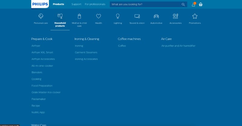
The categories align with your expectations; you know exactly what you’re going to get in each of the different sections.
They also then break it down into subcategories so you can get straight to the products you want to view even quicker.
The other benefit is a simple and subtle one, but very important – the expanded navigation menu stays there so long as your mouse cursor remains in the blue area. Again, so many websites have a drop down navigation function that only shows you a bit at a time, and it can be difficult to click on what you actually want.
Philips have made it easy by taking up the whole screen. The user is looking for what they want, so why would you try to show them something else on the page? Just have the navigation consume their screen so they can focus on finding what they’re after.
The homepage isn’t cluttered
Many retail brands try to show off as many products as possible, with the idea that if they show the customer enough things they’ll end up buying something. Philips takes the opposite approach and keeps it simple.
Firstly, the rotating banner shows only three products. It’s unclear if these are the most popular, or are ones that the brand is currently focussed on promoting, but they do share some similar characteristics.
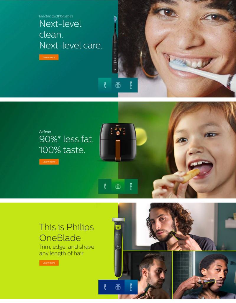
In 6 to 12 words they tell you what the product is and what the benefit is. The product itself is literally front and centre, and the image helps you figure out who it’s for.
Furthermore, below they showcase some of their most popular products, in case that’s what you came looking for.
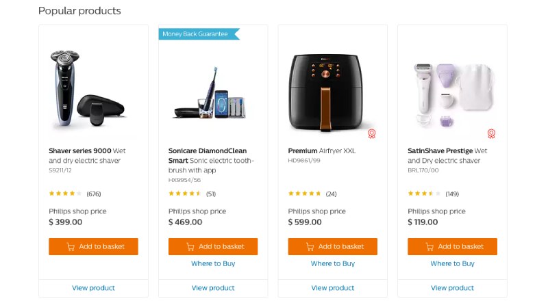
They then showcase some of their core categories with a short and simple paragraph to promote it, and a call to action to learn more.
This all aids in making it as easy as possible to navigate the site and find the products that you’re looking for.
They focus on giving the visitor the information they need
It’s not enough to just show the visitor the product they want; they also make it very easy to find the information you need in order to make a purchasing decision.
They highlight the benefits of buying from them directly
This is evident on the home page where below the search bar they highlight some key benefits you get regardless of what product you purchase.
This might seem obvious to other ecommerce sites, but it’s not common on retail sites. Check out Sony and LG and you’ll see nothing like it on their home page.
This is how you can tell that Philips is dedicated to ecommerce more than other electronics brands.
They keep the visitor from getting distracted
Let’s take a look at the category page for electric toothbrushes.
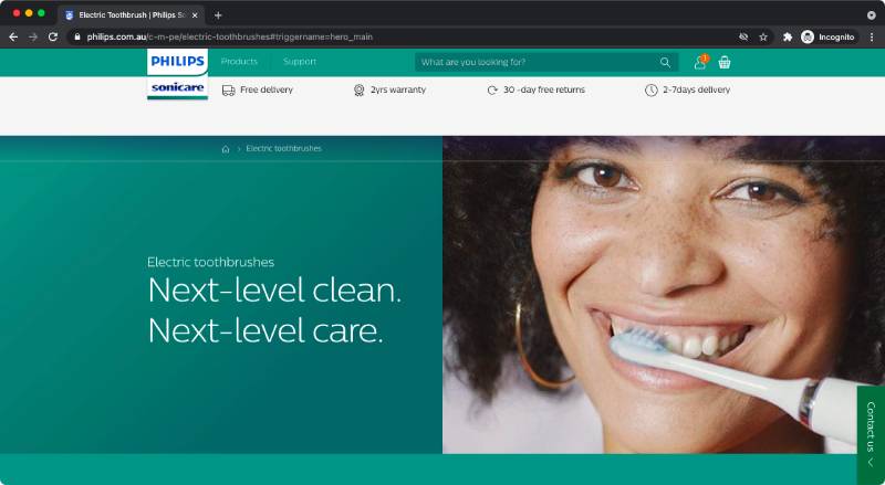
Notice anything interesting about the navigation bar?
It’s gone!
Most ecommerce sites would keep it there because they want you to browse and buy more products, but if I were a betting man I would wager that Philips customers don’t often buy multiple different products in the same session.
Sure, I might have the same brand of electric toothbrush as I do beard trimmer, but am I going to buy them both at the same time? Probably not.
By removing the navigation bar, Philips are removing potential distractions and things for the user to click on that are not related to their initial decision to click into the category. It’s the same logic that applies to landing pages built for advertising campaigns – removing navigation funnels the user towards buying.
They help to narrow down the options
The rest of the category page for electric toothbrushes is great and tells you everything you need to know about why their toothbrushes are the best, but it’s nothing particularly special.
What is special are the ways Philips help you choose which toothbrush is right for you.
Philips has 31 different electric toothbrush products – that’s a lot.
How do you know which one is right for you?
Well, they have a standard ecommerce comparison page that allows you to look at up to 3 products side by side and decide which one is right for you.
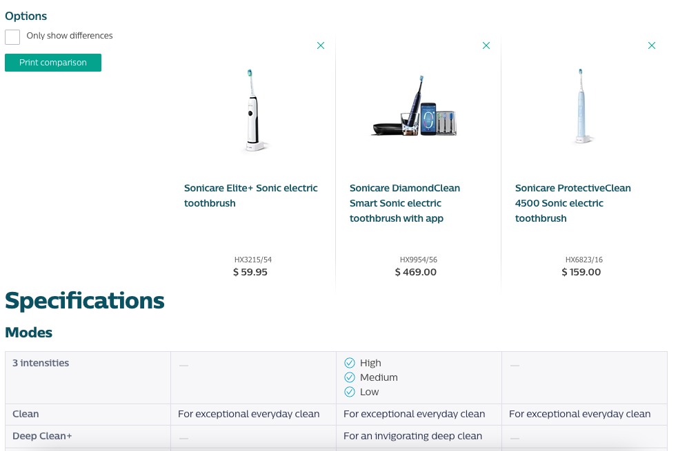
(The specifications go on and on, by the way. I had no idea there were so many different ways to evaluate a toothbrush).
While a comparison function is useful when you have a range of products to choose from, it only helps if you really know what you’re looking for. For those who don’t know, Philips has an advisory tool.
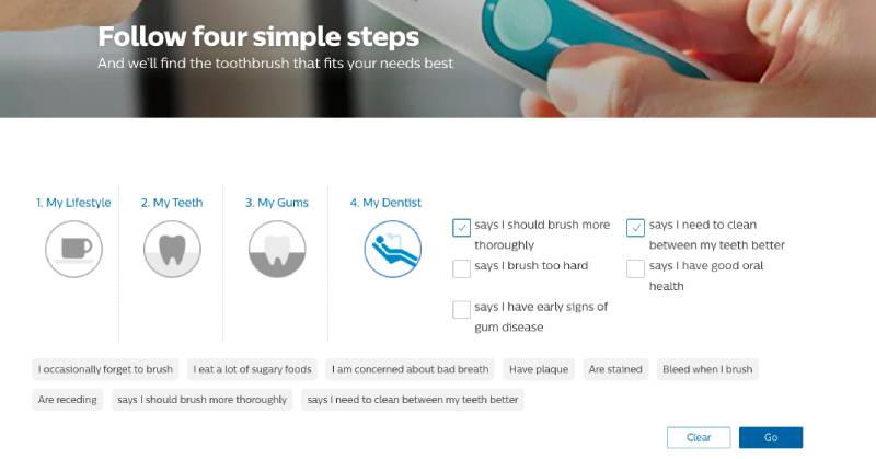
By checking a few boxes to let them know more about you, Philips then provides you with a recommendation that’s tailored for your needs.
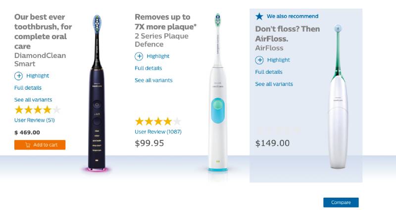
The cynic in me was expecting to only see the most expensive options, but they’ve provided two options at very different price points, as well as a third complimentary product. I’m impressed.
The idea here is that if you can provide value to your customers and show them that you’re trying to help, you’re more likely to gain their trust and earn their sale. Much like a salesperson in a retail store would ask questions to make a better suggestion.
Key Takeaway: Philips invested in their website not only as a way to showcase their innovative products but, more importantly, to buy them. They make it easy for customers to find the products and information they are looking for, which makes it easy for the customer to make the purchase.
They take the customer on a journey
When selling directly to consumers, you’re more likely to be successful if you can guide the customer along their path to a sale.
Where branding might only focus on awareness and the top of the funnel, a strong D2C approach considers all stages of the customer journey.
Let’s take a look at how Philips does that.
They use sequential advertising to go from awareness to conversion
Sequential advertising is the process of presenting ads in a specific order, essentially drip feeding your audience the information they need about your product.
It goes without saying that very few purchases are made the first time someone hears about a product. I’ve often heard it compared to relationships – you wouldn’t ask someone to marry you on the first date, they need to know if you’re the right fit for them.
In this 2018 Google case study we can see how the Philips team in Romania targeted users at different stages of the funnel in order to convince them to make a purchase, but I thought I would break it down with current day examples.
Here’s how Philips sells air fryers through Facebook.
They capture attention to generate awareness
The first part of the journey is to let people know you exist and see if you can capture their attention.
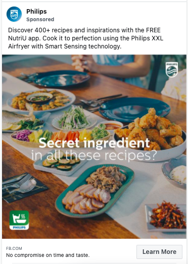
If you’re into food then the image should catch your eye – it’s what our Head of Creative calls “Thumb-stopping content”.
The next thing people will spot is the headline which helps to pique your curiosity, what is the secret ingredient?
That’s often enough people to get people to click but if not then the post copy gives more information to let you know what the post is about.
Clicking through takes you to the following canvas page

A Canvas page is really useful because they require very little design/development and don’t need to be hosted on your website – which means you don’t need to run them past your IT department, you can get them up and running in minutes.
They’re also great because you’re not trying to give the visitor all of the information in order to make a sale. All you’re doing is testing the waters to see who would be interested in cooking food like this so you don’t need to stress too much about what’s on it, just make it look good.
It’s likely that this ad has some pretty broad audience targeting. It’s also likely that they’re targeting parents or maybe even a lookalike audience of previous purchasers.
Again, this is because they’re not trying to sell with this ad, they just want to narrow down the audience to find potential customers and spark some interest for further down the line. The broader your audience at this stage the better (within reason).
They give the audience something to consider
Targeting at the next stage is easy – they’re remarketing to the people who clicked to see the Canvas page.
They are probably also remarketing to people who have been on their site to look at air fryers, as those people who need to be convinced and are likely shopping around.
The ads now are all about explaining the benefits of the product. People have seen what it can do so it’s a good time to give them more information to help them make an informed decision.
For example, this video helps you imagine what it could be like if you owned the product and the narration outlines the benefit “If you don’t want to miss the best moments in life then the Philips xxl airfryer is what you need.” The device is about saving you time.
You can also tell it’s not intended for conversion based on the “Learn more” button. The call to action is direct and low in commitment, it prompts you to just check it out and leads to the landing page for the product.
This is just one example of the videos Philips are running at this stage. They have several different variations and also multiple different formats including carousels and full screen video (for Instagram).
The audience will likely sit in this stage for a while and see a number of the ads before moving to the next stage.
They convert the most captive audience
We’ve now got a very clear audience of people who have shown additional interest in the product by some combination of watching videos all the way through and/or clicking through to the landing page at least once.
These are the most engaged and captive people who are most likely to buy the product. Not to say that everyone who has engaged up to this point will, but they are your best chance at closing a sale, so let’s have a look at the type of ads they run at this stage.
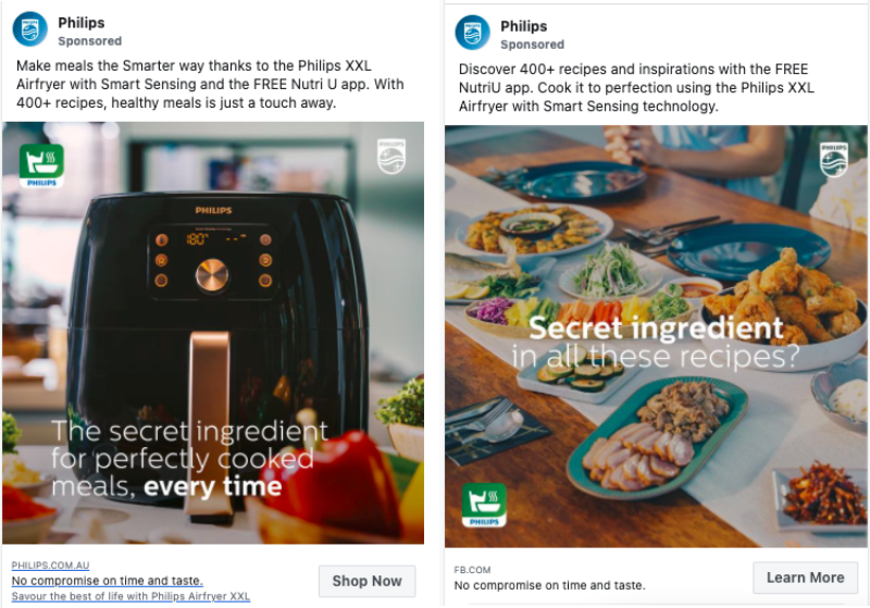
The ads are simple and straightforward. Even the image is very simple – it’s the product.
The call to action changes to signify the intent they believe the audience has at this stage. It’s time to buy.
There’s no need to overload the creative with all the benefits; the audience already knows the benefits from the previous stages. They can now hit them with a simple line and expect that a portion of the audience will convert into customers.
Key Takeaway: There are so many blogs and companies who like to say that the marketing funnel is dead. They try to change it into a different shape or add stages and layers, but the truth is simple. Capturing people’s attention, giving them reasons to buy from you, and then asking them to buy from you works.
It might take longer than it used to and involve more channels, but the concept of the funnel still works – and Philips has used it to full effect.
They own the search space
A key factor in selling direct to consumers is to make sure you’re advertising wherever your customers are.
And as effective as Philips’ funnel strategy on Facebook can be, they know it won’t capture all of their potential customers. Even the best funnels have leaks, and one of the biggest places those leaks lead to is Google.
People will see ads for a product on Facebook (or anywhere else online and offline) and then look it up on Google.
They will look it up to see the price, see who else is selling it, find out more about it, read what others are saying about it, what alternatives there are, and plenty more.
Their advertising on other channels prompts the audience to search
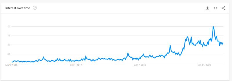
We can see how effective Philips top of the funnel strategy is by looking at search data.
This data from Google shows the search volume for air fryer related keywords over the last 5 years. You can see the increase has been very sharp in the past 12 months, largely driven (I believe) by the pandemic and people cooking at home more. Remember when everyone was making their own sourdough?
Anyway, I’m not suggesting that Philips caused this increase in demand for air fryers, but digging into the data a little more shows the impact they’ve had.
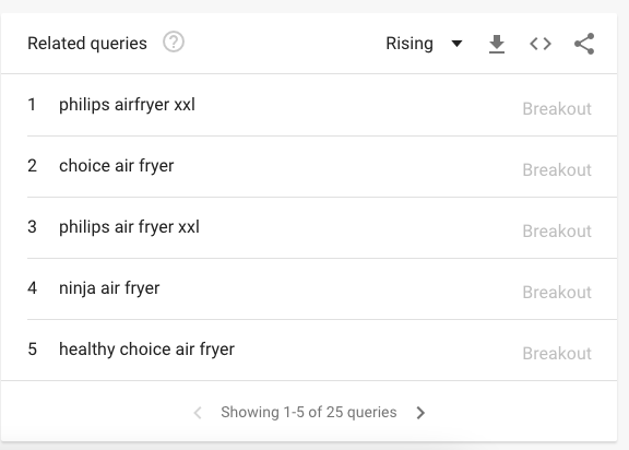
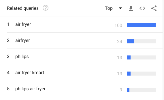
Philips appears in the top related queries, as well as the fastest rising. On par with or above kmart, a product that is $500 cheaper!
Some of this could be down to word of mouth, as people who have bought one are probably telling their mates about it. (I’ve never used a Philips Air Fryer but judging by the reviews they’re pretty good).
But for Philips to be this prominent would suggest to me that they are doing a great job of generating awareness for the xxl air fryer, and people are then looking it up at a later stage.
So how do they take advantage of this high – and growing – search volume?
They invested in search, quickly, when the pandemic hit
Many (if not most) companies lost business and revenue when the pandemic hit and we all went into lockdown. This is especially true for retailers who relied on brick-and-mortar sales.
Some pivoted to digital quickly, others weren’t able to.
Due to Philips already having a great ecommerce platform, they were able to comfortably increase their investment in digital to make up for the lack of sales elsewhere.
They accelerated their spending
This graph shows Philips’ estimated spend on Google Ads over the past two years (according to SEMRush). Notice the bump in June and then the significant and sustained increase 3 months later?
This suggests to me that Philip’s ran a test to see how successful they could be with paid search, got great results and went back to ask for more money. When they were given it, they doubled down to drive growth and make up for lost time.
But it’s not just paid search where they focused their efforts.
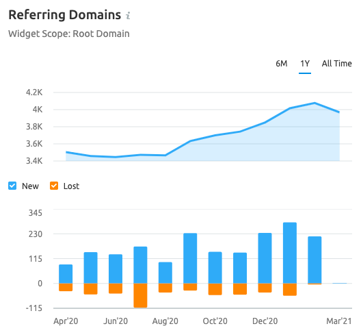
Here you can see two graphs that show many domains are linking back to philips.com.au – notice the significant change in September?
Having seen how much of a return they could generate from paid search, my analysis is that Philips decided to go hard on organic search too, and started building links to improve their SEO.
The result?

From the low in July 2020 to the end of March 2021 their organic traffic has increased by 24%! That figure is 29% at its peak (October 2020).
SEO is a notoriously slow channel to grow so much so quickly, and particularly on a base of more than 300k monthly visitors –this is a very impressive feat.
They do just the right amount of experimenting with their ad campaigns
If we delve deeper into the data around their paid search strategy, we can see they take a smart approach to experimentation and testing.
Every business should be running experiments with their marketing, but how much experimenting you should do is dependent on the numbers involved.
If there’s a lot of search traffic, you have the opportunity to run more experiments. The more you run, the more you learn, the more you grow.
However, if your search volume is low and you’re experimenting a lot, then you’re probably not getting enough data to make your conclusions statistically significant and ultimately you end up wasting your time for very little long term growth.
They have lots of ad variations for high volume terms
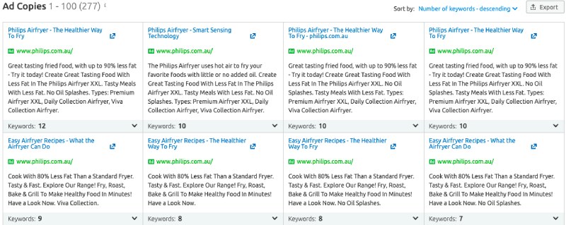
You can see here that Philips are running 277 ad variations with “air fryer” or “airfryer” in the copy/title. Some of these ads have 12 keywords associated with them, some only have one, and there’s a big range in between.
The ads with one keyword are likely to have been whittled down over time. It’s not possible to say for sure, but I assume the keywords belong to single keyword ad groups (SKAGs).
They’ve done enough testing on those keywords to know that they deliver results when paired with a particular winning ad creative.
The ad variations with multiple keywords are currently being tested to find the right combination before later being added to a SKAG to maximise performance.
They’re able to run this strategy because the keyword volume around air fryers is so high.
They experiment less with lower volume terms
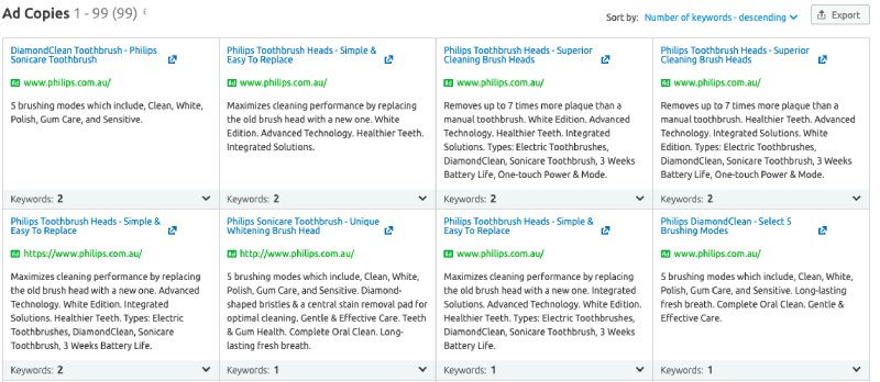
Their ads for toothbrush related terms are significantly fewer – only 99. And the maximum number of keywords for each is only one or two.
This is likely because the volume is lower, but it probably also represents Philips focusing their efforts on the areas that are going to drive them most growth.
Key Takeaway: We’ve already seen that Philips do a great job of generating demand through funnels, but they also do a fantastic job of meeting that demand by being very present on search. They reacted quickly during the pandemic and experiment just enough, on the right things, in order to keep driving growth.
They harness the power of their happy customers
D2C marketing doesn’t stop once a customer has made a purchase.
Philips has a number of initiatives to ensure customers continue to use their products, come back to buy something else, and tell other people about their products.
You can see this in a number of ways.
They give customers real reasons to hand over their email address
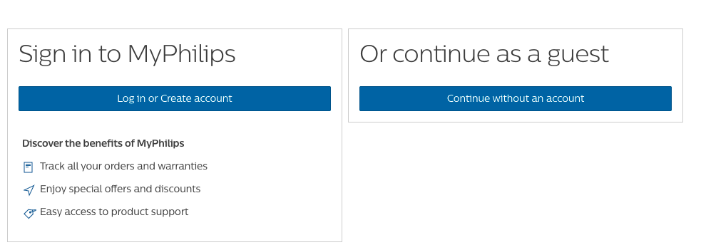
When you go to checkout on the Philips website you are given the option to sign in or create an account. This is pretty common with many online retailers who promise exclusive offers and promotions.
That’s all well and good for fashion stores that you might visit multiple times, but as a retailer of electric goods, less relevant for Philips.
Instead they offer something that consumers of expensive electronics really care about – warranties and additional support!
Have you ever scrambled around looking for a warranty for a faulty product? I know I have, and having them in one place would have been a real help.
Additional product support would also be really welcome when things go wrong.
They provide additional content with their products
Remember this ad that we reviewed earlier?

One of the big selling points for the air fryer is that it comes with an app that’s loaded with recipes.
Having an air fryer seems great. Having an air fryer with 400+ ideas on how to use it is even better. It shows the customer that you care about how they use the product, and want them to get the most out of it.
As well as improving their overall satisfaction, it builds trust between the customer and the brand. That means the customer is more likely to come back (probably when they receive a promotional email courtesy of signing up for extra support and warranties).
It also means they’re more likely to leave a favourable review.
They direct happy customers to Product Review
Product Review is a website that collates opinions and reviews about consumer products. I believe it’s a platform that Philips focuses on.
Here’s a screenshot from a search on Product Review for Electric toothbrushes.
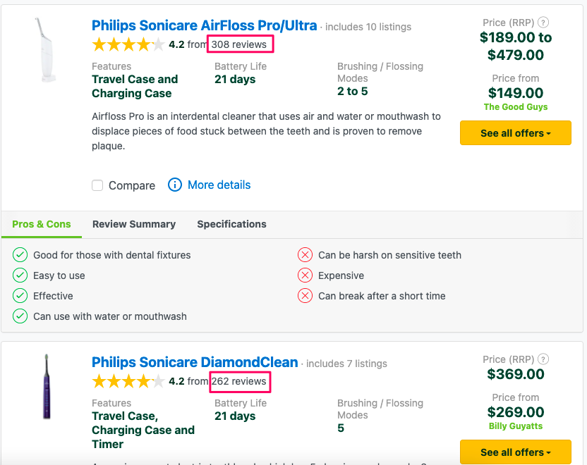
The top two Philips products have more than 550 reviews between them, and Philips have 34 electric toothbrushes listed on the site.
The award winning products from competitor Oral-B only have 425, and they only have 14 products listed.
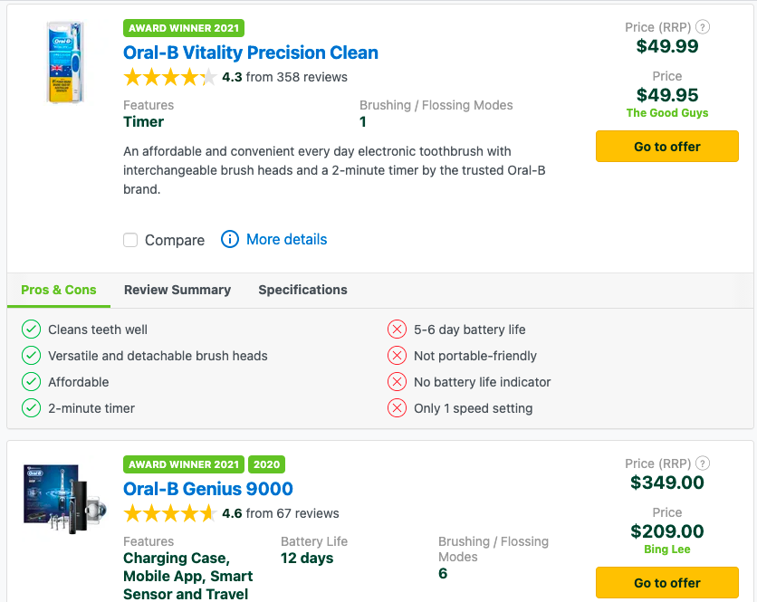
I believe that Philips are driving their happy customers to Product Review in order to leave a review that others can see.
Why Product Review?
For many customers, product review is the first place they go to compare products and make a decision about which one to buy. In fact, it drives significant website traffic for many of our clients.
Given they are not running Google Shopping ads (which would display the ratings directly below), it seems the best choice for Australia.
They run ads on Product Review
They don’t just send happy customers to Product Review, they advertise to potential ones too.

As I said, it’s a platform where many customers go to do their research, and so it also seems like an obvious place to advertise.
It also has the added benefit of users being able to click straight through and read reviews that are unbiased, as they are sitting on a third party platform.
Key Takeaway: Philips sees the value in the customer journey beyond the conversion, and continues to support the customer to improve retention, repeat purchase, and advocacy.
Summary
Philips’ digital marketing strategy, at least when it comes to performance, seems to be built on the four key principles of:
- Their website is optimised for ecommerce
By having a site that is optimised for ecommerce transactions (as opposed to displaying products) Philips are set up to maximise the value of every website visit. Whatever marketing they do, whether it’s offline or online, will increase the chances of someone visiting their website, and when they do they’re more likely to buy because of the focus on sales. - They take the customer on a journey
Philips utilises good old marketing funnels for individual products across different channels in order to guide the customer from being aware of their products, to giving their audience the info they need, and finally to converting them into customers. - They own the search space
While Philips have been doing a great job of generating awareness, they also were quick to invest in search after the pandemic in order to ensure they were visible when their audience was searching for the products they’ve been advertising elsewhere. - They harness the power of their happy customers
Philips’ commitment to the customer doesn’t end with a transaction. They run a number of initiatives that help ensure retention and advocacy to keep fuelling the customer journey.
As a 130 year old brand, I’m surprised to see that Philips are so forward thinking when it comes to selling directly to the customer.
With this approach running alongside strong brand campaigns, it’s easy to see why they’re still one of the top brands in the world.

