Xero’s Growth Strategy – How they acquired 350k users in the last 12 months
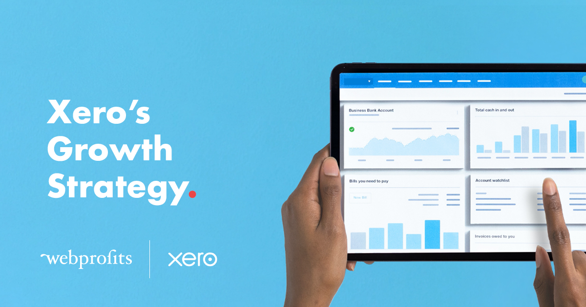
Xero is one of the darlings of the startup world.
Partly because its platform has helped so many new businesses launch and succeed, but also because they’ve been there and done it themselves.
Like many great businesses, Xero was founded when founder Rod Drury was having issues with his existing solution. Back in 2006, he felt that traditional desktop accounting software had become outdated and set out to create a cloud-based product.
Fast forward to 2018 and Xero has more than 1.3 million subscribers and a market cap of approximately $6 billion.
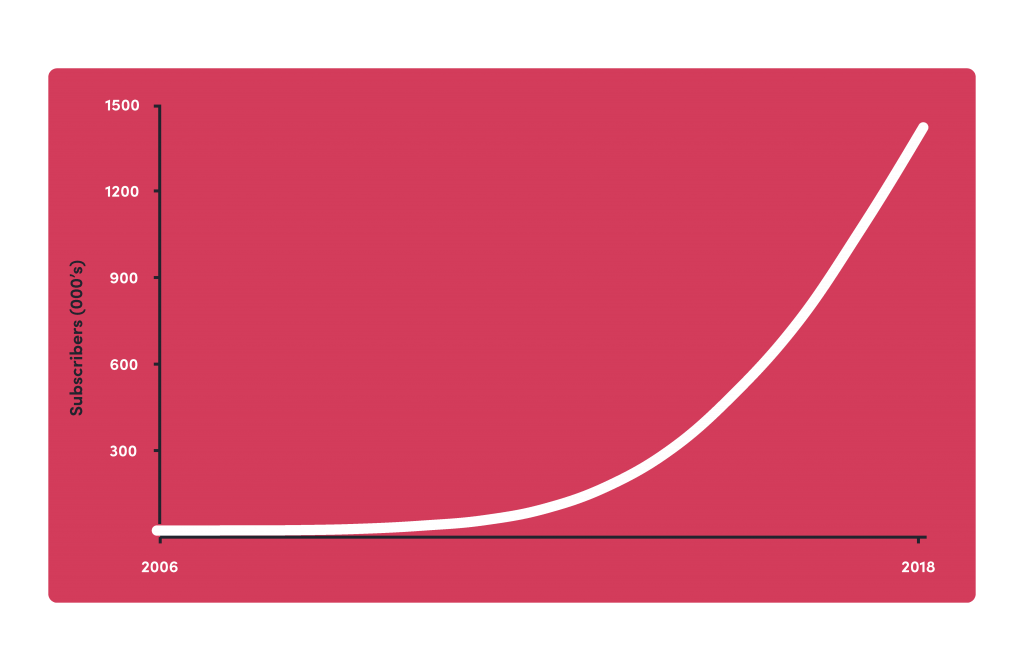
Despite scaling up to such a large user base globally, Xero shows no sign of slowing down with 351,000 subscribers added in the past 12 months. 30% growth for a business that already has a million subscribers is a fantastic result, so we wanted to figure out how they do it.
I’ll start by giving an overview of how Xero has gotten to this stage, what their product is like, and how their website drives their growth. I’ll then introduce each member of our in-house growth team and allow them to break down what Xero are doing across their respective specialisms.
Growth History
The Product
The Website
Email Marketing
Paid Search
Organic Search
Content Marketing
Social Media
Community Marketing
Event Marketing
YouTube
History of growth
Partners
Xero are in a really interesting market.
Though their end users (customers) are small business owners, many of these people have their business finances managed by an accountant or bookkeeper. As a result, promoting their product directly to the end user wasn’t the most effective way to grow fast.
Early on in their timeline, Xero understood that if it could reach accountants and bookkeepers, and have them buy into the value of their product, then Xero could accelerate its growth and bring in the revenue to help them grow elsewhere.
It’s an approach that they execute very well by providing an extensive partner program. As well as doing what it can to help their partners generate more clients, Xero offers exclusive events and even awards to provide as much value to their partners as possible.
Their investor briefing back in September 2016 highlighted the strength of this approach, pointing out that more than 90% of their paid subscriptions in Australia & New Zealand (their most developed markets) came from accounting partners.
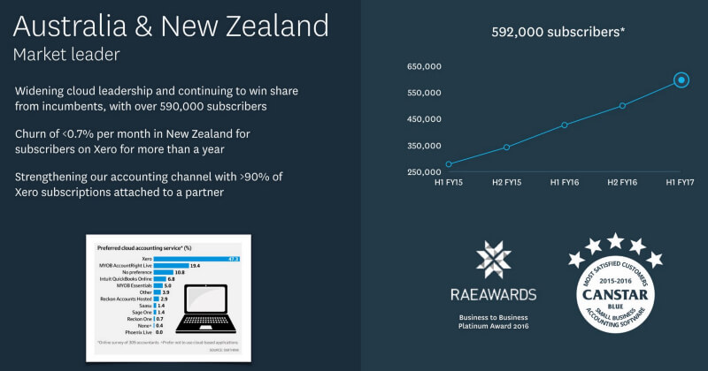
Though this undoubtedly is a factor in their success, this article will focus more on the marketing they do directly to small businesses.
“What gets measured gets managed”
One thing that is clear from reading Xero’s financial reports is that they are big on recording and improving metrics. Though this shouldn’t be a surprise given the business started out as an accounting software, it’s something that we see a lot of companies neglect.
As a SaaS business, there are probably thousands of metrics that Xero could track, but their annual reports show these metrics distilled into a small handful that actually make a difference when it comes to business growth.
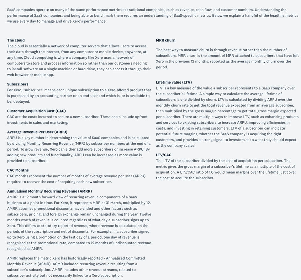
In my opinion, it’s impossible to achieve sustainable, significant growth if you don’t have a solid understanding of what metrics determine the success of your business, and are able to track and improve those numbers on an ongoing basis.
As you can see from their definition of Annualised Monthly Recurring Revenue, Xero are not afraid to change the metrics they use to define success as their business changes.
BONUS: Looking to level up your approach to digital marketing? Click here to learn more about our Fluid Marketing service, a collaborative and relentless approach to growth.
The Product
Xero came to the forefront as a cloud-based solution, and that helped to disrupt and revolutionise the accounting industry, but they needed (and still need) a lot more than that in order to stand out from their competitors and grow.
In this section, I’ll be outlining what the marketing is actually selling and how it fits into how the company positions itself.
An award-winning product
Great marketing would fall flat on its face if the product is no good, and Xero’s product is exceptional whichever way you measure it.

Source: Canstar Blue
In fact, for the last four years in a row, Xero have come out on top when Canstar Blue have compared different accounting platforms. Xero, of course, uses these awards as selling points across its website and marketing, but we’ll come to that later.
One of the reasons Xero is so popular with customers is the number of integrations it has. Xero seamlessly integrates with thousands of banks in the countries it operates to bring in data in real time. They also focused on building integrations with other software companies so that relevant data can be shared securely, automating processes and saving businesses time.
Beautiful Business
Though Xero started out as an accounting platform, it has since evolved into a small business platform with a new tagline to match – “Beautiful business”.
This shift outlines to me one of Xero’s biggest strengths: their commitment to putting the needs of the customer first.
Having achieved so much as an accounting platform for small businesses, it would have been easy for Xero to widen their reach and start looking at applying those solutions to enterprise level businesses and go after significantly larger average values.
Instead, Xero recognised the value of their product, and their customers, and decided to expand the product into providing even more value to their target audience – small businesses.
This dedication to helping small business is evident throughout their website and marketing (which we’ll be delving into later in this article). In fact, having a strong tagline can be an asset across a business. It’s something that anyone in the company can refer to in order to help guide them in their work, at any point they can stop and think “How does this align with the business goals/values?”
You’ll see throughout this article how Xero really focus their messaging and imagery across their website and marketing on small businesses. By doing this, they’re making the brand and product more relatable to their target audience, increasing the chance of converting and keeping them as a customer.
A further example of their commitment to the customer is the feature request section of their community site.
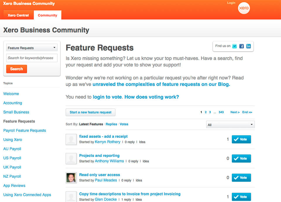
This is a prime example of what people mean when they refer to a customer-centric approach, and Xero does it very well.
The website
Ok, now we’ve taken a look at who Xero are and what they do, let’s start looking at how they actually promote and market themselves.
We’ve said it time and time again that without a good website, a company will always struggle with their digital marketing. It’s the storefront of the 21st century and having it set up correctly could make or break your business growth, so it’s worth the time and effort to get it right.
Xero’s website is pretty large so I’m obviously not going to break down every single page, but I will look at a couple of key ones that most companies will have, especially SaaS businesses.
The homepage
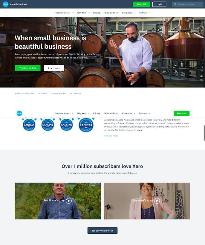
Xero have a textbook SaaS home page in my opinion, and I’ll be breaking it down element by element to highlight exactly what they’re doing.
Above the fold
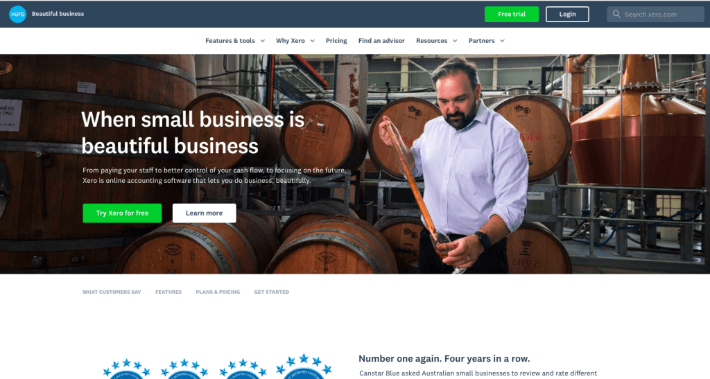
Let’s focus on the most important bits first – everything above the fold.
Headlines
On its own, I think the headline is actually a bit weak but it works brilliantly in conjunction with the subheadline, and it brings in their “beautiful business” tagline.
Together, the headline and subheadline succinctly explain what Xero does, who it’s for, and what the benefit is to the end user. It outlines how all-encompassing the platform is without outlining each individual feature, and points out that using Xero allows small businesses to do what they do best – focus on their business.
Buttons

Next, let’s take a look at the call-to-action (CTA) buttons. Firstly, they stick out like a sore thumb, which is exactly what you want them to do. The green contrasts really well against the darker backgrounds that they sit on, and so the eyes dart to them right away.
Then there’s the wording of the CTA itself – “Try Xero for free” and “Free trial”. It’s a low commitment action that I would probably want to do if I was interested in becoming a customer of Xero. And if you’re visiting Xero for the first time, you might consider learning more by actually signing up.
If you already know about Xero and have been thinking about signing up, then the CTA is also exactly what you came to the site to do.
More importantly, it’s concise and direct in that I know exactly what will happen if I do click that button. I’ll be signing up to Xero, and I won’t need to pay. Simple, but effective.
I also want to talk briefly about the buttons beside the green ones. I like to call these “ghost buttons” in that they are buttons but don’t stand out beside the brightly coloured ones. These give users an alternative navigation route if they’re not ready to purchase, or already have. That keeps them on the site until they find what they want – nice!
BONUS: Looking to supercharge website leads or sales? Request a Website Audit and our team of experienced consultants will prepare a detailed report outlining what levers you need to pull to drive more high-value customers.
The image

Website images should be selected with purpose; they should always relate to the copy/topic around them somehow, and I think this image does a great job.
It shows someone (presumably a business owner) working on their business. It would have been easy to show the platform itself and highlight the features, but instead it highlights the benefit of using Xero – the fact that you can focus on what you do best. It’s also just one guy on his own, which is what it must feel like for a lot of small business owners.
The job itself and the setting are also interesting – I think it highlights that Xero customers come from all different kinds of professional backgrounds and industries. Therefore, Xero as a platform is applicable to all sorts of backgrounds and industries; it’s about doing beautiful business.
The navigation

If the headings and buttons don’t immediately give you what you want, you should be able to find it in the navigation bar. The headings in the bar relate really well to what you would like people to do: Find out more about what your product does, find out why it’s right for them, see how much it costs, get someone to help them with your product, support their business, or more info if you’re a partner and not a customer.
The choice of a white background also helps it to stand out but not overwhelm the page so that the buttons are still the focal point.
The rest of the homepage
So, someone has landed on the site and hasn’t immediately found what they want – that’s to be expected. What happens next?
Canstar Blue award

Well, the first thing they point out is their award wins (which I referred to earlier). This is an awesome place to put the Canstar Blue award info; it lets the user know right away that other people rate the platform highly, and that gets buy in for the rest of their visit.
Customer stories
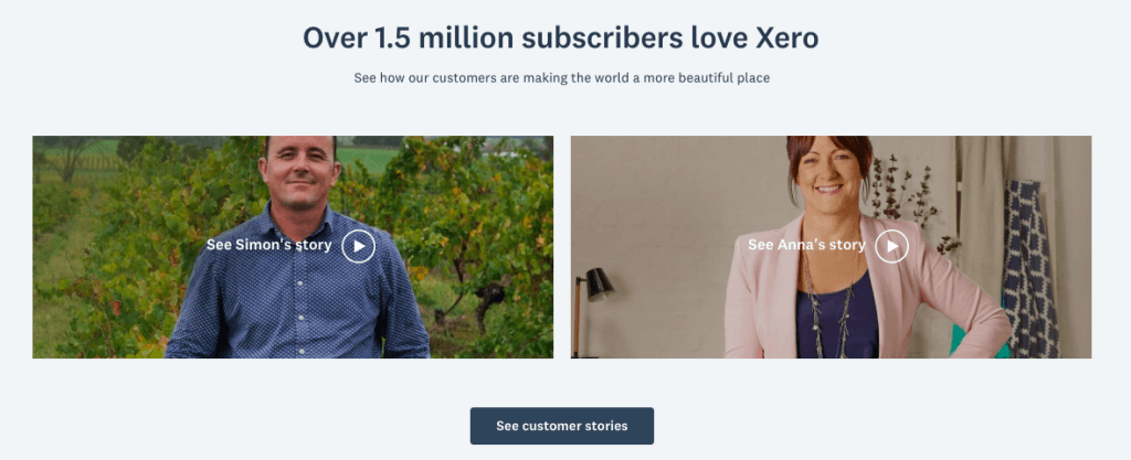
Along that same theme, the next section is more social proof in the form of customer stories with a header that boasts how many users they have. If “over 1 million subscribers love Xero” then it’s got to be pretty good, right, but the videos themselves are also a great asset.
They’re only 2 mins long, they highlight what people love about being an entrepreneur, the problems they had with accounting, and then their opinion on Xero. They’re concise, they’re relatable, and they’re very positive about Xero – exactly what you want in a testimonial.
The fact that they’re also videos is a bonus point. People get tired of reading sometimes, and it’s good to have information displayed in a few different formats to keep people engaged.
Features
Notice that it’s only after the website focuses on the (potential) customer and what’s in it for them that Xero start to talk about what the platform does in detail.
The features section is clearly laid out and easy to navigate around. Each feature headline makes it clear what you can do, and then the accompanying copy elaborates a bit more.
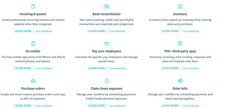
I also really like the language used in this section. Not once do they say something like “Xero does..” or “we can..”. It’s all about you and what you can do.
If you want to find out more about any particular feature you can click to learn more, but you can also watch a short video overview if you’d rather consume the info that way. The best part of the video overview is that it doesn’t navigate you away from the page, which allows you to come back and watch an overview on the next section when you’re done. Brilliant.
Pricing
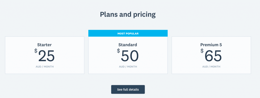 Xero don’t go into a lot of detail here and I think that’s fine. If people are still scrolling around then it’s likely that they aren’t ready to talk about pricing yet, but they do provide enough information to allow the user to make a quick decision around whether it’s affordable.
The decision on whether it’s worth it or not requires a lot more information, and for that you need to click through to see full details.
I would personally like to see a little bit more information about what distinguishes between the different price points on this page – maybe just the biggest points with a CTA to click to read more. Having said that, I think it does a good job.
Web Form
Finally, we come to the all-important web form.
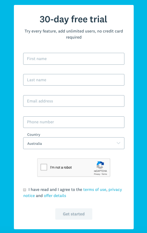
The header “30 day free trial” and accompanying sub header do a great job of telling the user what happens when they fill this form in. It also tells them what they don’t need to do – add credit card details. For many SaaS customers, adding credit card details for a free trial is a frustrating stumbling block, as a lot of them worry about being tied in or forgetting to cancel.
I don’t think there’s a right or wrong answer on whether you should collect card details for a free trial, you would need to look at your own data in terms of acquisition and activation rates to decide if you should charge for a trial or not. But you’re likely to end up with happier customers (or at least fewer unhappy ones) if money doesn’t suddenly start coming out of their account a month down the line. (Check out this article if you want help deciding)
Beyond that, it’s a pretty simple and standard web form. Nothing distracts from the details being added, and they don’t ask for too much information given it’s a free trial. I would argue whether or not they need to collect a phone number at this stage, but I would assume it is so a sales team can follow up to support the trial and provide assistance if needs be, in order to turn them into a fully fledged customer.
All in all, this is a great home page. It has all of the elements you need to make a good impression, keep someone on your site, or get them to convert.
Features page
Though the home page touched on some of the features, Xero has a page where they outline a lot more about what their platform is capable of. It’s worth pointing out too that the navigation bar extends out to help you get to the features you’re most interested in even quicker.
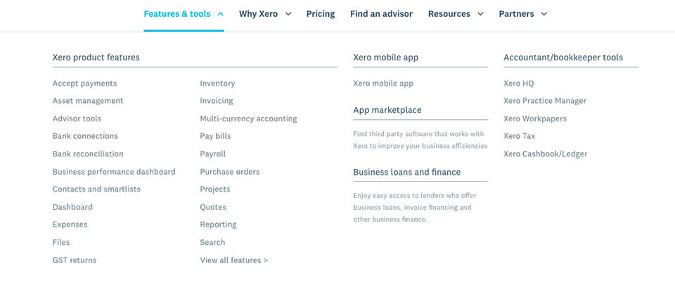
Now for the page itself.
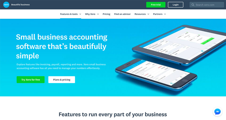
Above the fold it looks a lot like the Home page does. The layout is the same, as is the headline, sub headline and button placement. Let’s break it down like we did the home page.
Headlines
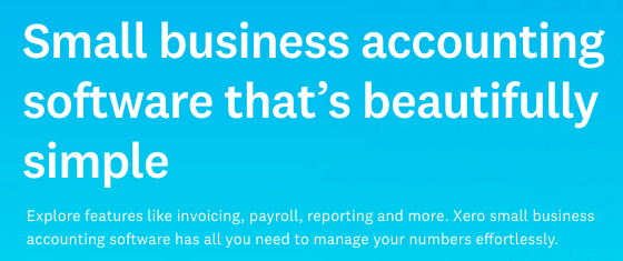
The main header here is a lot more direct than the one on the home page. The user has shown interest in the features of the platform and so Xero’s message is one that sums up the features. This headline stands alone really well, but is supported by the subheadline very well too.
Together they once again outline what Xero does, who it’s for, and what the benefits are. This time, rather than focus on the benefit of letting you run the business, it highlights the benefit that it makes numbers effortless.
Buttons

The button placement and colour are the same as on the home page, so not much to highlight that is different – even the CTAs are the same. This consistency from the previous page means there’s no doubting what the next step is if you want to go ahead and use Xero.
The one thing that does differ is the ghost button. Rather than a generic “learn more”, Xero directly guides you towards the different plans and pricing options, which would be the logical next step.
Image

Remember how an image of the software was the wrong thing to go with on the home page? Well, it’s a great option for the features page. Someone on the features page wants to know more about what the software does so it’s a good idea to actually show it to them.
The image itself is great too.
Firstly they’re showing you that they have mobile and tablet versions of the platform without having to spell it out as a feature, which is pretty cool.
However, I think the really clever part is what’s on the screens. It’s a clear layout, not too much being displayed and it’s got clear colours. It looks like a simple accounting software for small businesses, exactly what it says in the headline.
The features
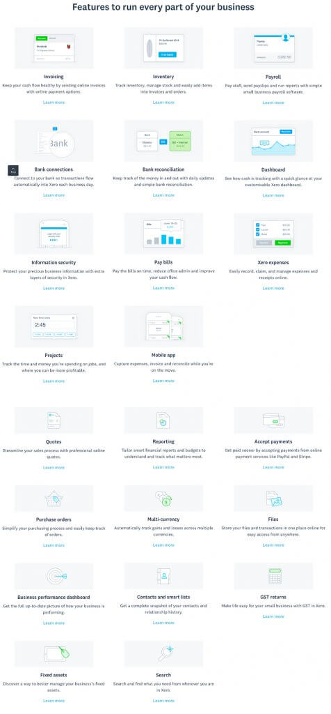
Now we get into the features themselves.
Though every feature listed on the home page is visible, the wording used is different. Let’s take the Payroll feature as an example.
On the home page the mini header was “pay your employees”, and the copy said “Calculate the payroll, pay employees and manage payroll taxes.”
On the features page the header was “payroll” and the copy said “Pay staff, send payslips and run reports with simple small business payroll software.”
The change in language here reflects the change in the users’ intention. When scrolling the home page they are still learning about what the benefits of Xero are whereas on the features page they need to know what it can do. It’s a subtle distinction but one that Xero understands and adapts for very well, in my opinion.
The other interesting part is the image they use to visualise the features. It made sense to use icons on the home page to keep it simple, but by using mock ups of the features on this page it gives the user more insight into what the feature does. Another subtle but clever change.
24/7 Support

Xero has not only saved the best feature for last, they’ve also nailed how they promote it.
Small businesses owners are often not technical, and certainly not accountants (except for people who own small accounting firms). There’s nothing worse than not being able to work out how a software works when it’s critical to your business, and many entrepreneurs have spent countless frustrating hours trying to work things out.
Having support available 24 hours a day takes away the concern that the platform will be difficult to use and means that the user knows they won’t be struggling for hours if something goes wrong or they can’t figure out how it works. Just another example of Xero’s customer centric approach.
Now let’s look at the mini header – “Never be put on hold again”.
I’m sure every person reading this has been put on hold for a service at some point in their lifetime if not their career. Don’t you just hate it? This header perfectly signifies the benefit of 24/7 support and I love it.
What isn’t on the page
As great as this page is, I think it’s missing something…
Social proof!
Yes, the home page had plenty of it, but what if someone didn’t scroll down on the home page or clicked straight through? What if they clicked through the organic sitelink after searching for the brand?

You’re counting on someone having already seen it somewhere else, but there is no harm in having something on here that shows not only are there loads of features, but that other people think those features are actually useful.
A company of Xero’s size must have an array of testimonials and case studies, and I’m sure they could have picked one where the customer was singing the praises of the features alone.
Surprising.
Pricing page
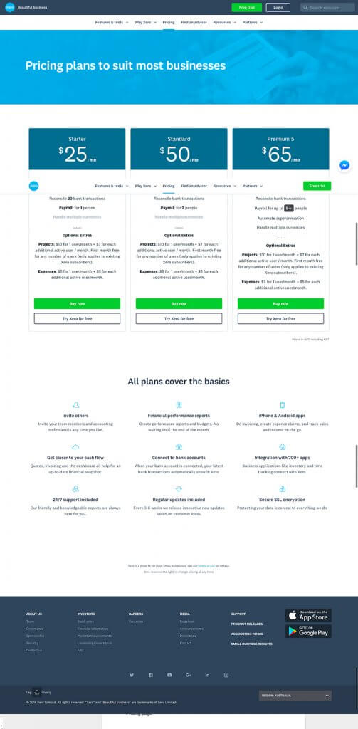
Now we come onto the pricing page, arguably the second most important stand-alone page (after the home page) for any SaaS business (and most other businesses who display a price online).
Above the fold, Xero has kept it really simple. There’s no need for creative imagery, clever headlines, or bright calls to action. The intent of the user visiting this page is to find out how much it costs, so you should give them that information.
Pricing
I don’t love how Xero has displayed the different options here – there’s an awful lot of text on the screen at one time and it’s hard to differentiate between the different packages.
Unlike on the home page, Xero hasn’t outlined that the middle option is the most popular. OK, it’s not the most creative approach to CRO (conversion rate optimisation) but you want the potential “average” customer to know what the “average” customer buys. It just helps speed up the decision making process.
The cheapest option has more text in bold than either of the other two options, making it slightly more noticeable. Maybe it’s a good thing that the eye sees how limited the options are, but I’d rather the user looks to the right as much as possible.
And then we get onto the optional extras …
Where the main details of the features available at each price point are clear, concise and take up a line each, the optional extras are a mess of paragraphs. Yes, they’re not easy points to get across, but there are cleaner ways to do it.
For example, rather than have all of the info on the page at one time, why not have a bit of the details on the page and then a little icon (maybe a question mark) which displays more when you hover over it? At the moment the extras overshadow the main elements and they push the call to action buttons below the screen.
The call to action buttons are great, giving the user the option to purchase straight away or go into a trial – but with the main button being to purchase. This should help people who have made up their mind skip ahead and get straight into paying, but allow those who are still unsure to play around first.
If a user can skip a part of your funnel and not have their journey disrupted then it’s fine for them to do that.
The features again
Outlining the features once again on this page is a great move. It’s a confirmation that no matter what price you pay you get access to all the features that made you wonder how much it costs in the first place.
But it also serves as a reminder of exactly what you get when you pay for Xero. And it’s very handy for anyone who may have skipped ahead without looking at the features.
Notice how there are no links to elsewhere on the site from the content on this page? That’s because when a user gets to the stage of the funnel where they’re looking at price, you want them to hit purchase or trial and not really anything else.
What’s missing?
They’ve done it again – no social proof!
Pricing is usually the final step before a user converts, and having testimonials is a really simple addition that could help them get the end user over the line.
Website overview
This isn’t a comprehensive review of their site by any means, but it should give you some insights into what a good SaaS website should look like.
In my opinion, Xero’s website looks great on the face of it, but when you dig a little deeper there are definitely improvements that could be made to help them step it up a notch or two and help convert more customers into trials.
Email Marketing
The primary function of email marketing in Xero’s marketing mix is to convert users on a free trial to paid subscriptions. This is where we start to move away from acquisition and instead start to look at activation.
And because this step sits right before Xero generates revenue, it’s important.
Many businesses fall into the trap of obsessing over acquisition at the expense of activation. Businesses need to be constantly working to improve their activation rate, as the activation rate is a key determinant of what is the maximum you can afford to acquire new customers.
So, Xero might be getting the right people to register for a free trial, but how do they get them to engage with their product and convert to a paid subscription?
That’s where Xero’s onboarding sequence comes in…
This is what I was able to map out based on my experience and engagement with Xero’s platform:
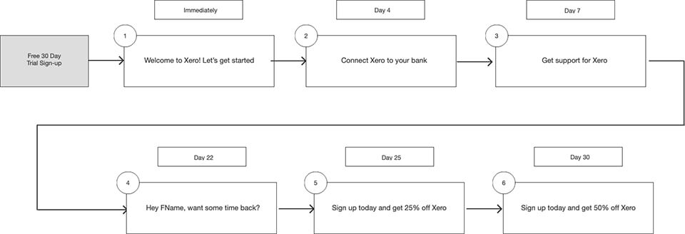
Some examples of the above emails are included below
Note, Xero are using Marketo for their email marketing, which you can normally work out from the email sender information:

Xero’s onboarding sequence is adaptive to how users are engaging with the product, using different triggers to ensure the email journey is reflective of what steps users have taken to get Xero setup with their business.
For example, Emails 2, 3 and 4 acknowledge that the user hasn’t engaged with their free trial yet and directs users to their support site to get answers or help from the Xero team. If the user has engaged with the product, these emails do not send (we cross-checked these emails across two different users, one who engaged with the product, one who did not).
As users approach the end of the 30 day trial (assuming they still haven’t become a paying customer) Xero offers the user a discount on their first 4 months of use in order to close the sale. Once the user’s trial ends, a more aggressive discount is offered to the user (again assuming the user hasn’t already converted to a paid subscription). To drive urgency, both of these offers use time-based scarcity, expiring just 4-5 days after the users are notified of the offer.
What’s most important to note about Xero’s onboarding sequence – and not enough businesses do this – is that their messaging explicitly reflects the activation stage of the funnel.
Once users have demonstrated interest in the product by registering for the free trial, Xero focuses exclusively on getting users to start using the product. For example, based on my user behaviour, Xero’s sequence spoke to specific steps such as connecting my bank account or contacting their support because I wasn’t engaging with the product.
What’s important to note here is that Xero’s messaging is very different at the acquisition stage (Facebook ads, landing pages, XeroCon) versus the activation stage (their onboarding sequence).
Xero’s approach to acquisition marketing places emphasis on specific customer case studies (emotional response) and results/outcomes (logical response) but, once users have signed up for a free trial, speaking to case studies and results is no longer as effective as these users are likely already product and solution aware.
These are the key friction points Xero needs to address with their onboarding sequence:
- Time – How much time will it take to set up or migrate from an existing accounting solution? Will Xero save me time on a daily basis?
- Ease of use – Is Xero going to make my life easier?
- Cost – Is Xero cost effective for our business?
Xero’s onboarding sequence definitely speak to potential time savings and ease of use at each step of the journey:
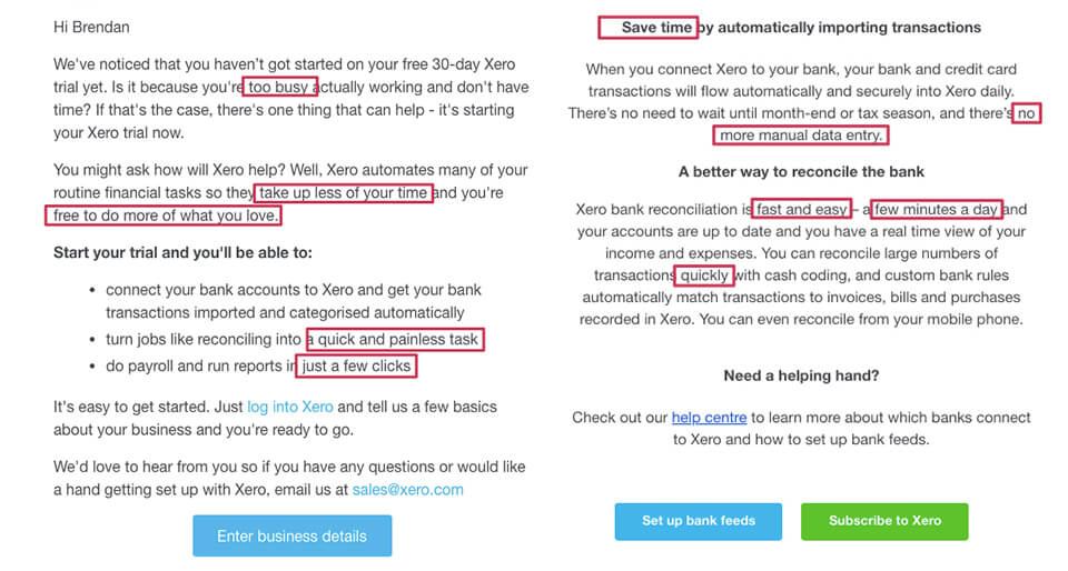
Xero’s promotional emails at the conclusion of the free trial also aim to minimise the cost friction by easing users into a paid subscription with a discount:
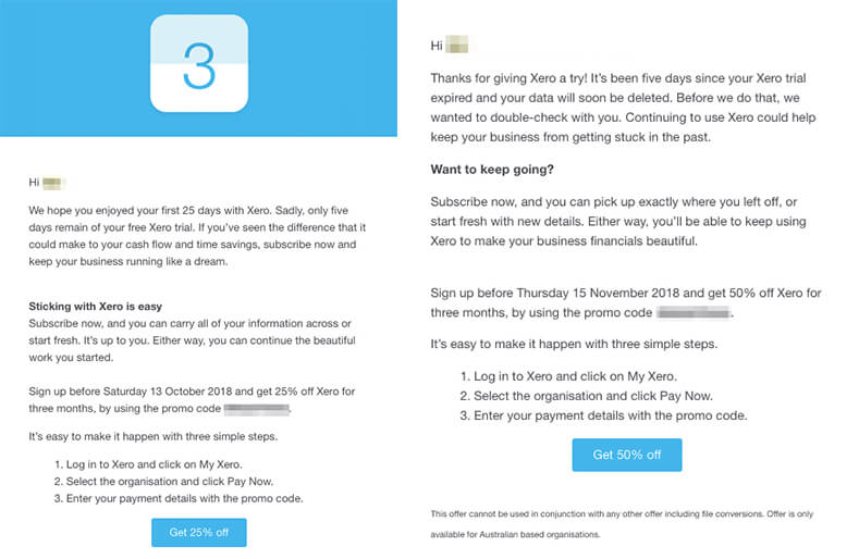
All marketing (and product) efforts for users in the activation stage should be focused on removing any friction that may prevent the user from digging in and engaging with the product’s sticky features.
In terms of minimising user friction at the activation stage, Xero does this well.
Where to from here?
To convert more trial users to paid customers, an approach Xero could split-test against their existing sequence is explicitly structuring their onboarding journey as a guide to ‘Getting up to Xero-speed’, leveraging more of their training videos and testing higher email frequency.
These emails don’t have to get into the details. Instead, each email could have animated video calls-to-action that link users directly to the relevant training video. Xero should ensure that each email links how the various features save time and money and makes small business finance easier.
Each email could also contain a ‘trigger link’ that allows users to trigger the delivery of the next email immediately if they so wish. This would allow users who wish to get set up more quickly accelerate their activation.
This iteration could be tested against the control as a split test in Marketo, identifying paid conversions as the main success metric. Once results are statistically significant, the losing sequence should be retired.
Depending on the prioritisation of marketing activities in the pipeline and internal resources, a new split test could be prepared and executed based on prior learnings.
Paid Search
Like most companies that are proficient at paid search, Xero is using a combination of different landing pages to cater to prospective customers at each stage of the conversion funnel.
Although we cannot account for all campaigns, keywords and ads Xero are actively running, nor can we uncover how Xero are structuring their ad accounts, we can draw insights from Semrush by classifying the keywords, ad copy and landing pages recorded.
From this approach, we can infer that Xero has likely run the following key campaigns over the last two years:
- Branded campaign – bidding on terms that contain ‘Xero’.
- Competitor campaign – bidding on terms that contain competitor keywords such as myob support, myob payslip and intuit quickbooks;
- Terms that pertain to features or use cases – terms such as electronic invoice template, quote template;
- Terms that define what Xero’s platform does – terms such as inventory management system, bookkeeping software and best small business accounting software.
The above links correspond to landing pages that Xero have used in conjunction with these search terms on Google Ads.
Let’s jump into some of these campaigns …
Branded Terms
Xero is bidding on terms that contain their brand name because these top positions in the search results are targeted by their competitors, including MYOB and Quickbooks, and it’s important that Xero retain their presence when it comes to branded search terms.

Interestingly, Xero is sending paid traffic from branded search terms to their Accounting Software landing page, and not their homepage. This isn’t always the case, even for businesses who are heavily dependent on conversion-oriented landing pages for paid search. Instead, many businesses choose to send branded traffic to their homepage in case they are existing customers, and because for this audience, the search intent is relatively unknown so they choose to facilitate greater website navigation.
However, for paid search, I’m always an advocate that conversion-oriented landing pages are essential to getting the most out of your ad spend.
What’s puzzling about Xero’s branded ads is that although the Ad URL for the headline sends visitors to their Accounting Software landing page, their Sitelinks (Payroll, Pricing, Xero™ Accounting Software and Trial for Free) are not directing users to conversion-oriented landing pages, even though they have suitable landing pages with reduced navigation that they could use for each of these Sitelinks.
As a note, although the name ‘Sitelinks’ implies different pages on the website, you can certainly use Sitelinks to direct users to conversion-oriented landing pages and you don’t even need to use varied landing pages for each Sitelink. Instead, all four Sitelinks can direct users to the same landing page, in which case it works effectively to use each Sitelink to illuminate a different USP. This can be very effective for maximising your return on ad spend by ensuring you are prioritising your best-performing pages, and are not directing paid visitors to lesser performing pages on your website.
Although Xero is bidding on branded terms such as ‘Xero’ or ‘Xero HQ’, they appear to have negated some phrases such as ‘Xero Login’ and ‘Xero support’.
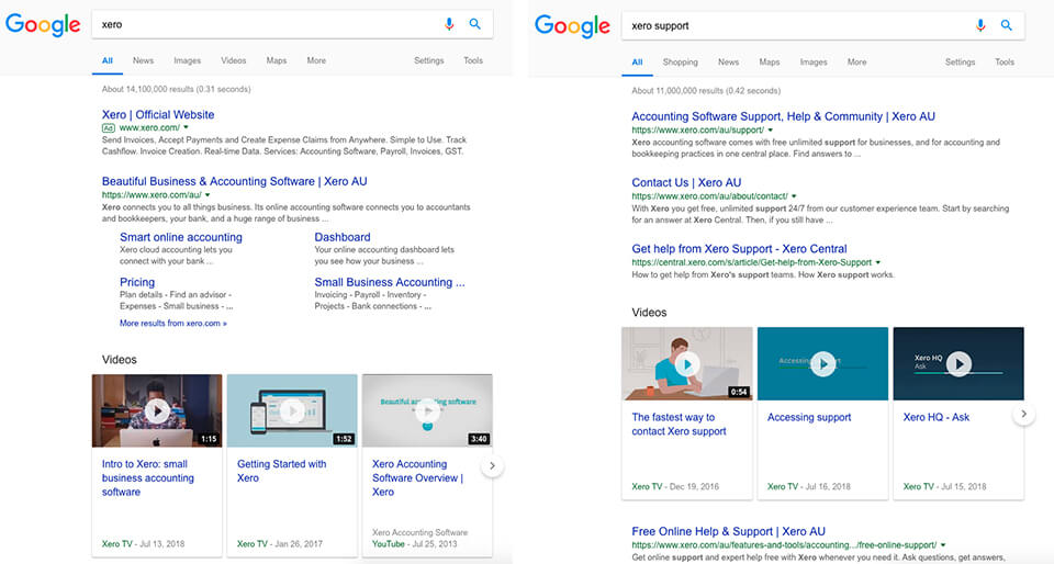
Xero could definitely go further with their management of negative keywords, as their ads are triggered for phrases like ‘Xero shares’ and ‘Xero market cap’. This is likely a poor use of ad spend and not suitable placements for customer acquisition-focused ads:

Competitor Terms
At the moment, it would appear from data in Semrush that the largest proportion of Xero’s paid search budget has been allocated to bidding on phrases containing competitors such as MYOB and Quickbooks. To support this strategy, Xero uses competitor landing pages coupled with ad copy that invites users to change to Xero.
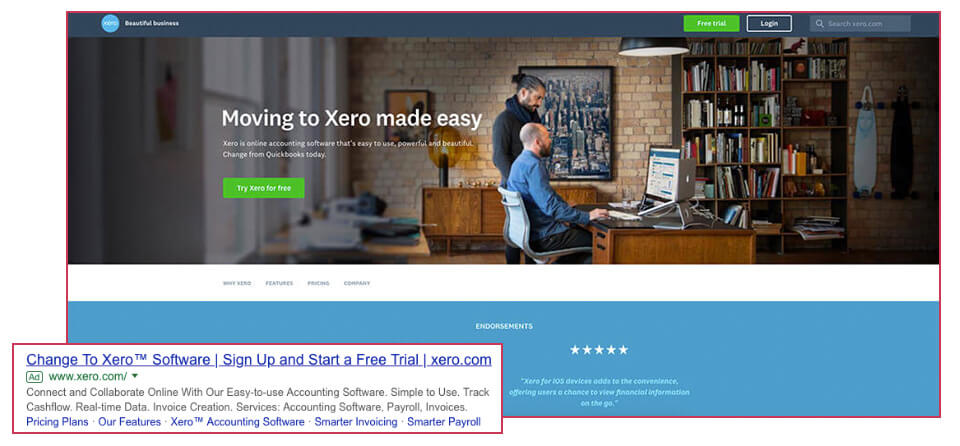
With top of page bids for competitor terms such as ‘Quickbooks’ or ‘MYOB Accounting’ as much as $20 per click, it’s important that their landing pages use direct response copy to ensure that the messaging strongly resonates with the user.
While Xero’s landing page does effectively communicate that the switch to Xero is easy and addresses key features and benefits, Xero does not provide any direct comparison. The only reference to Quickbooks in the above landing page is the discrete reference to this competitor in the subheadline. This is absolutely a missed opportunity and definitely something I’d be looking to test further.
Especially as their competitors don’t mind playing hardball…

Note, we’ve had clients who have had their competitors reference their brand name in ad copy, and we’ve reached a resolution by sending a cease and desist letter.
So, what’s a SaaS business doing this better?
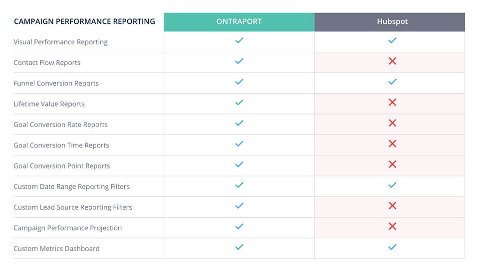
Check out how Ontraport have prepared comparison landing pages to target search terms pertaining to their competitors: Active Campaign, Get Response, Hubspot and Mailchimp.
For each of their key competitors, Ontraport outline how their product stacks up against the competition, showcasing which features have been overlooked by their competitors. I love Hubspot, but it’s hard not to take an interest in Ontraport with a feature table like the following:
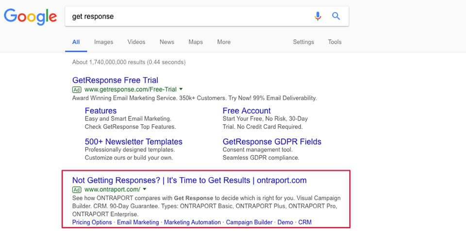
Ontraport uses each of these landing pages in conjunction with Google Ads campaigns that target terms like ‘get response’ or ‘active campaign alternatives’.
But back to Xero.
By taking a similar comparison approach, Xero can ensure that regardless of whether the user is a customer of one of their competitors, or isn’t yet using online accounting software, that they assert why Xero is the best solution on the market through strong supporting evidence, such as Canstar’s comparison:

Source: Canstar Blue
To get the most out of this strategy, Xero should definitely continue to target search terms that contain competitor names, such as ‘myob alternatives’ or ‘quickbooks reviews’, but could also target phrases like ‘MYOB Support’ and ‘MYOB Help’ to reach their competitors’ customers when they’re dissatisfied or losing their patience.
BONUS: Click here to learn more about our Paid Traffic Audit. Our team of experienced consultants crunch the numbers, analyse the data and dig into the results of your Google Ads account to ensure your money is being spent wisely.
Invoice Template Terms
One of the more interesting campaigns Xero have tested is targeting search terms such as ‘electronic invoice template’ and ‘tax invoice template ato’, and directing people to a landing page that speaks to how Xero’s platform can address their invoicing needs.
It’s likely that Xero identified there was adequate search volume around terms pertaining to invoice templates and that these terms may be less competitive than more commercial search terms like ‘accounting software’. Notably, this campaign reaches people who may not actively be looking for accounting software but may see how Xero’s templates could be saving them time and sign up for the free 30 day trial.
However, this type of approach is more top of funnel, with most users likely being at an awareness or consideration phase. This means that an effective onboarding sequence is likely essential to convert this audience into paid subscribers, as these are presumably less qualified leads because their search intent does not directly pertain to accounting software.
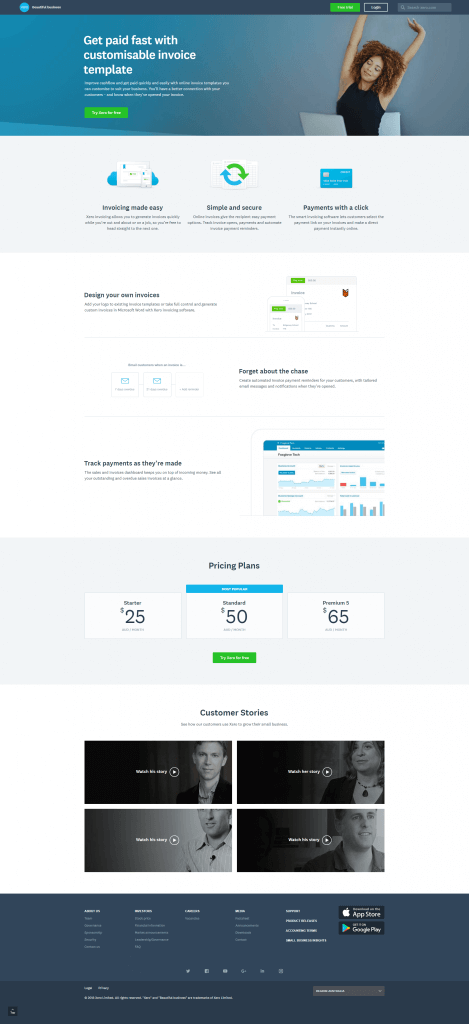
Xero should also be tailoring their onboarding sequence and in-app messaging so that it places greater emphasis on Xero’s invoicing features, as we know that invoicing was the initial need that triggered the user looking at Xero as a solution for their business.
Website vs Landing Pages
With the exception of Sitelink extensions, Xero is using conversion-oriented landing pages for paid search, instead of directing people to their homepage or product feature pages.
It’s worth noting that Xero is actively using 10 or so key landing pages, many of which have gone through multiple iterations, such as the two following pages:
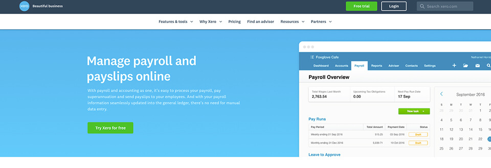
In Xero’s revision of this landing page, they have made 6 key changes:
1. Hero section
Selected a person-focused image, instead of an image of the product’s interface.
Revision:

Original:
2. Menu bar
The menu bar is no longer sticky and has fewer links to internal pages.
Revision:

Original:
![]()
3. Removing some of the emphasis on features
Xero removed the “Make life simple with payroll” and the “Want to know more?” sections.
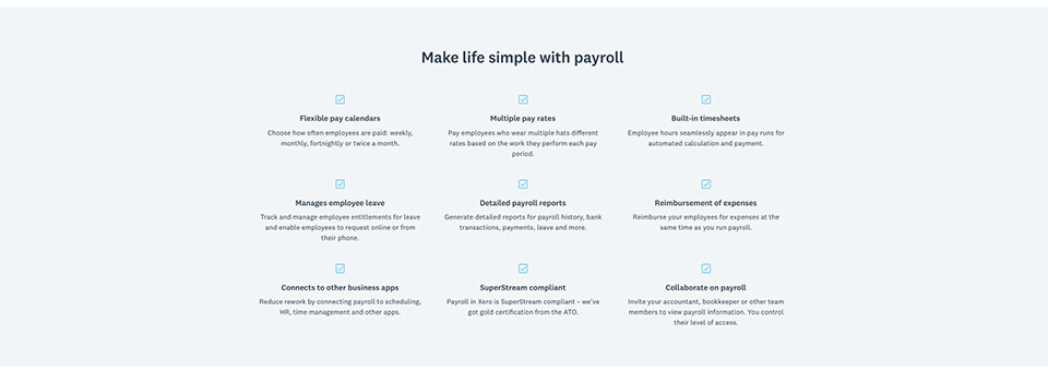
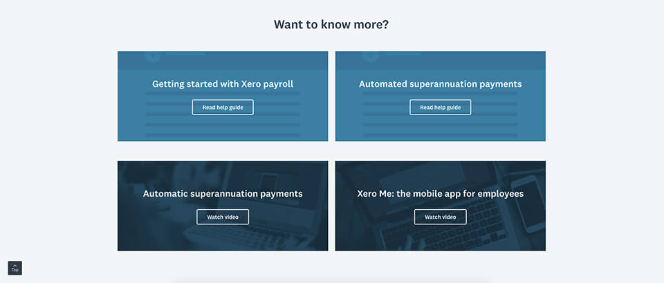
These details are likely more suitable at the activation stage than at an acquisition stage (discussed in greater detail in the email marketing section of this growth study).
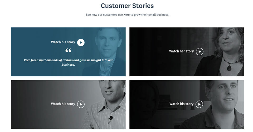
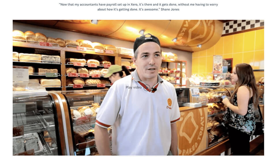
4. Customer stories
Including multiple customer success stories instead of one big video section – it would also be worthwhile to include a logo for each of these businesses in the preview so users can more easily find customer stories that resonate with them.
Revision:
Original:
5. Pricing plans
Xero removed the pricing plan section, so the landing page no longer speaks to how much Xero will cost. While pricing is likely less of a consideration for enterprise customers, it’s certainly a constraint for small businesses, so I would be interested to know how this change has impacted performance.

Certainly, what’s missing from their original landing page is an explanation of how these plans differ. Displaying multiple pricing tiers without an explanation of what’s included in each package would cause me to leave the page to Google this, and that defeats the point of a well-executed landing page.
Here’s a great resource on some best practices for SaaS pricing pages – there are a lot of considerations when it comes to pricing tables.
6. Final call-to-action section
Xero removed the final call-to-action – not having a call-to-action towards the end of the page conflicts with conversion rate principles. I would hope they have some data to suggest this is optimal.
Revision:

Original:

Key Takeaway: At face value from a conversion rate optimisation perspective, some of Xero’s updates make sense, some do not. Hopefully, in the instances where these updates do not follow typical conversion principles, Xero has insights that draw from how people are engaging with their web content, landing pages or product that provide an explanation for why Xero has made certain revisions.
Organic Search
Accounting software is a big market, with multiple players clawing for their target audiences’ attention. There’s a lot of noise online, making it harder for brands to reach consumers. And it’s not simply enough to have a good product, good ad campaigns or to create compelling content – you must be able to get noticed.
Search engine optimisation (SEO) is one of the ways Xero has been able to increase their discoverability and lead more potential customers to their platform.
Xero has shown that by targeting the right keywords, optimising their pages and creating exceptional content campaigns optimised for search, it is possible to move your brand forward with the right messages that engage the right audiences.
I’ll break down their approach, analyse their search and content marketing strategy, and offer some key takeaways. Let’s begin…
Keywords
With so much search volume and competition on Google for accounting and bookkeeping-related keywords, an investment in top organic rankings is well worth the time (for we all know that SEO is a long-term strategy) and energy.
Xero has invested heavily in creating a robust SEO strategy to drive growth and outrank their competitors for top, high volume search terms across their primary shores (Australia, New Zealand, the UK, and the US).
For the sake of this study, I’ll be looking at what they’re doing in Australia.
Their approach to keyword rankings can be categorised similarly to their paid search approach:
- Branded – ranking for phrases that contain ‘Xero’
- Product/service terms – ranking for phrases that describe their key service offering including “small business accounting software”, “inventory management software”, and “payroll”.
- Partnerships – ranking for phrases that contain branded partners including Deputy, Microsoft Power BI and HR Block.
- Competitors – ranking for phrases that contain direct competitors including MYOB, Reckon, and Quickbooks.
- Non-branded terms – short and long-tail queries that target keywords related to small business finance such as “best inventory management system for small business”, “can a small business get a tax refund” and “invoice template”.
The above links correspond to ranked optimised pages that Xero have used in conjunction with these search terms.
Here are the full reports that show you how they’re ranking on Desktop and Mobile.
Let’s take a closer look at some of these keywords…
Prime real-estate – the top 5 positions
Xero drives a large amount of organic traffic to their website from branded terms, holding the top 5 organic search positions for nearly 1500 keywords containing their brand name.
In fact, according to estimates from SEMrush, the term “xero” drives 52.78% of their organic site traffic to their homepage.
But, for now, we’re going to exclude branded terms to see where Xero has been able to drive traffic and organic growth to their site from audiences not actively seeking their brand.
Xero have a lot of top 5 rankings on Google for high volume non-branded keywords related to their services, including “inventory management software”, “invoicing software”, “payroll”, and “purchase order” – which is great.
Most importantly, Xero’s at the top of page 1 in the #2 spot for their top keyword phrase “accounting software”.
They’re also in spot #1 and #2 for “small business accounting” and #3 for “small business accounting software”.
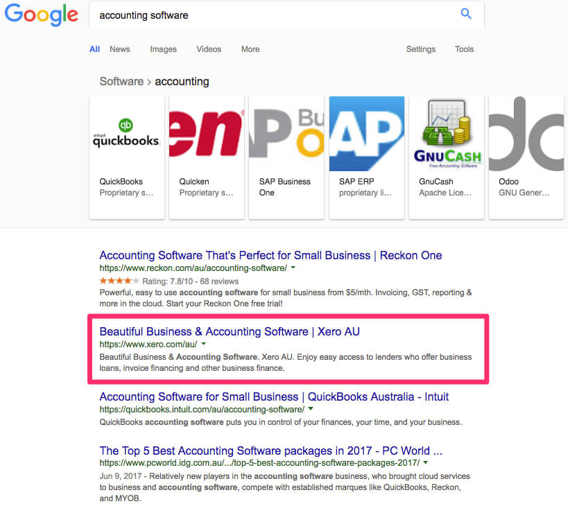
While they have a bit more work to do, remember that this is a highly competitive space with many advertisers also competing for these particular keywords in paid search.
This means that by ranking organically and driving traffic to service pages for these terms, Xero can actually calculate – based on the volume of page traffic and the average cost per click for Google Ads – the money they are saving.
Invoice template terms
As Brendan explained in his look at “Paid Search”, one of the more interesting non-branded keyword campaigns that Xero have targeted and tested has been around invoicing – in particular, invoice template terms and electronic invoicing terms.
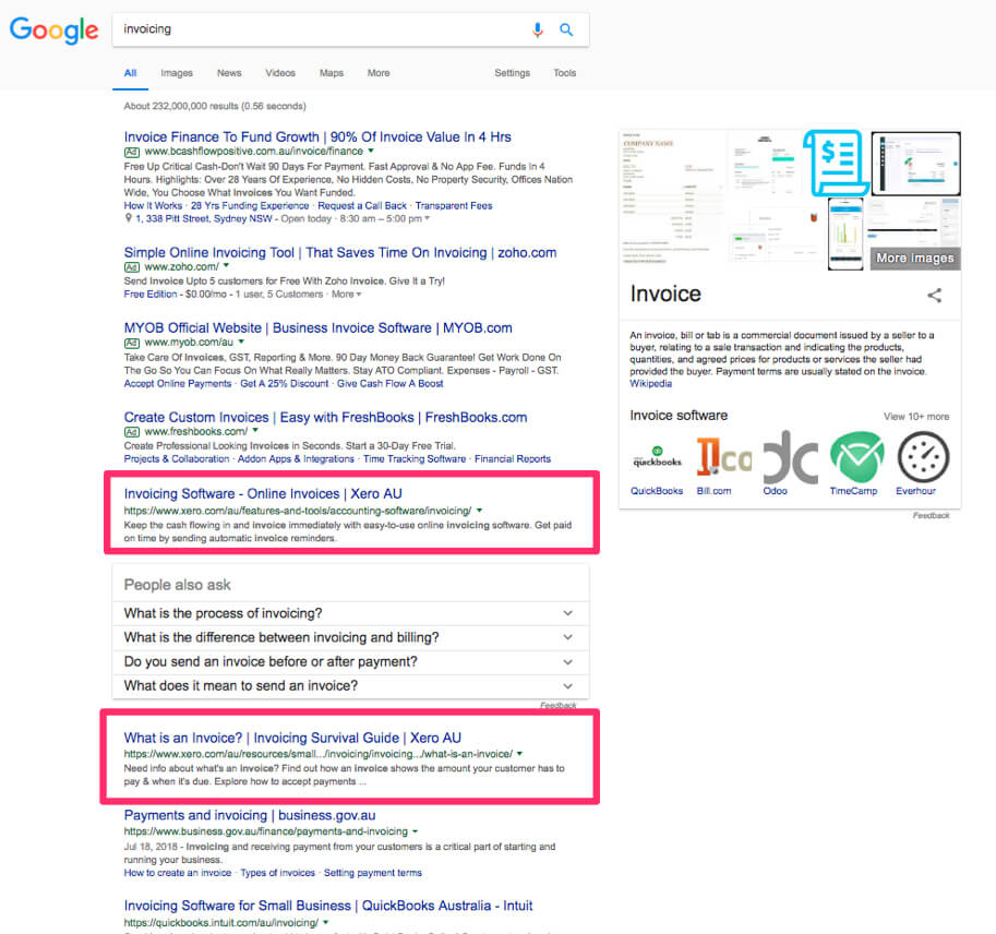
Note: Xero are already dominating the “invoicing” keyword rankings, holding both positions #1 and #2 on the first page of Google for their Invoicing service page and Invoicing Survival Guide. They’re also one the first page in position #5 for “invoice software”, but the search volume is quite low for this term with only 720 average monthly searches.
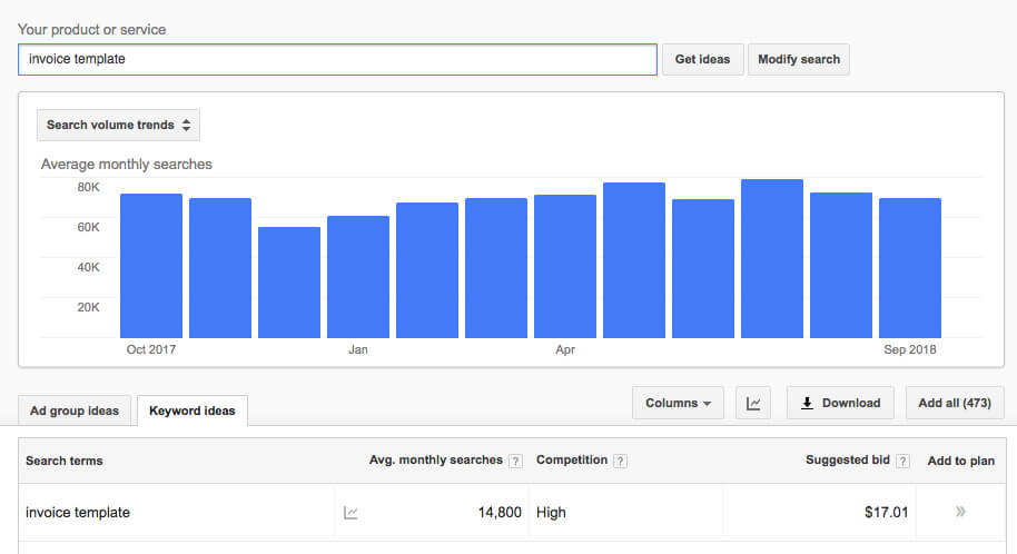
Looking at the keyword “invoice template” in Google Keyword Planner, we can see that it has that an average monthly search volume of 14,800 with high competition and a suggested bid of $17.02.
From SEMrush Organic Positions report, we can see that Xero is in position #4 on page 1 for this highly competitive term.
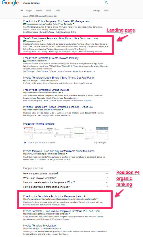
Xero has a bit of a way to go to get their organic page ranking above the fold.
Two ways they could continue to improve this page’s rankings include:
- A more diverse and aggressive backlink acquisition strategy (a topic I’ll speak more on shortly) for this URL
- And create content to be published on third-party websites on topics such as “How a Small Business Can Make the Switch from Manual to Automated Accounting” and “What Templates a Sole Trader Needs to Run a Business” with a natural link back to this page.
BONUS: Not getting results from your SEO strategy? Our team of expert search and content marketing consultants can prepare a detailed audit that uncovers exactly what your competitors so you can outrank them. Click here to find out what's included in our SEO & Content Marketing Audit.
Keyword gap analysis
In any SEO campaign, it’s important to run an SEO keyword gap analysis to know:
- a) The keywords your competitors are ranking for that you are not
- b) The keywords that your competitors are ranking for on page 1 that you’re on page 2+.
This information is highly valuable as it gives you potential keyword opportunities to go after that could be valuable to your business, and shows you the type of content or pages you may need to create to rank for those keywords.
Using SEMrush’s Keyword Gap Tool, I am first going to take a look to see all of the keywords that MYOB and Intuit Quickbooks rank for on page 1 (in positions 1-10), that Xero does not. I’ve also sorted by volume to see what the average number of times these terms of search per month on average.

From the basis of this report, Xero is doing very well competing with MYOB and Intuit Quickbook. However, we can see a number of small opportunities that Xero could consider going after in order to drive more organic traffic to their platform and away from MYOB and Quickbooks.
The one that really jumps out at me is “ bas” (short for Business Activity Statement) with an average monthly search volume of 8,100. There’s also “lodge bas online” (1,300), “how to lodge bas online (140), “submit bas online” (110), and “bas for dummies” (50).
While MYOB and Quickbooks both rank on page 1, Xero is nowhere to be seen.
On further research, I found that Xero does have one page that talks about “bas”, but the title tag has been optimised to rank for “Business Activity Statement’. While it is ranking in page #11 for this keyword, it has a lower average search volume of just 1,600, and still sits below MYOB and Reckon. They could create a dedicated page such as a ‘small business guide’ to target the higher volume primary term “bas” and the lower volume secondary terms such as “how to lodge bas online”.
While it has a much lower volume than the above, it’s interesting to see that MYOB is ranking in position #1 for “starting a cafe” (210), and Quickbooks in is position #8. Why have they done this? While it’s a small volume, if someone is thinking about opening a cafe then providing them with the information early on is a great tactic to build awareness and nurture the reader early in the sales funnel. While Xero has a dedicated service page for “Cafe Accounting Software” it is currently targeting the much lower volume keywords around “run a small cafe’ (10). They could optimise the web copy or create more site content to better target audiences looking to get started and rank alongside their competitors.
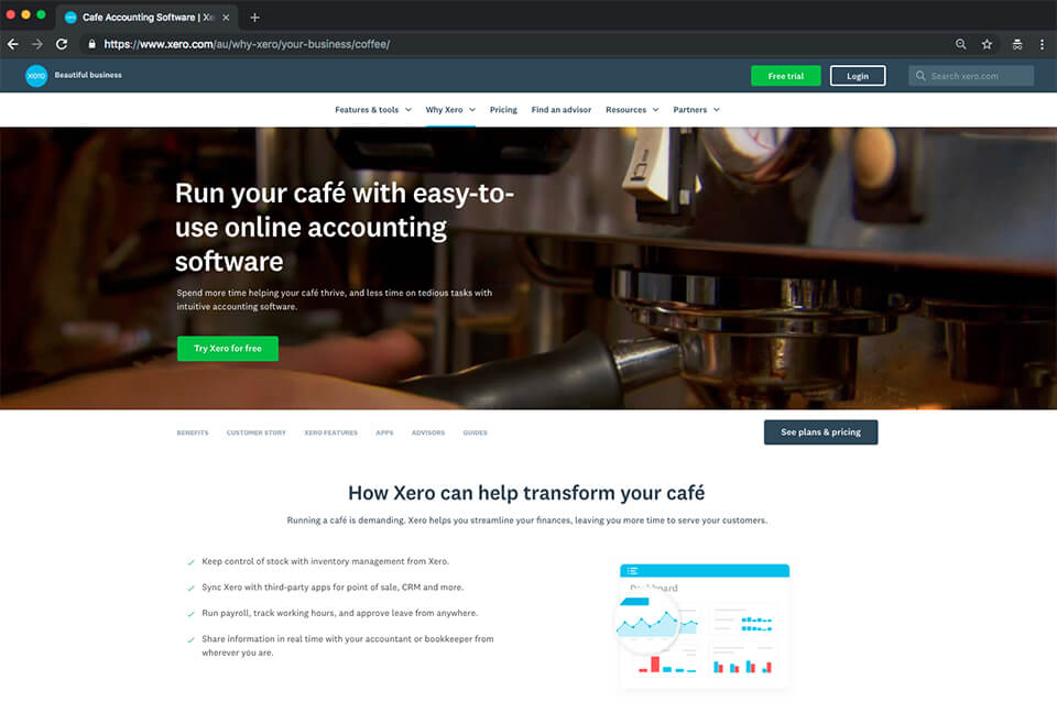
According to Moz, 71% of search traffic clicks occur on page one of Google, and page two results come in at below 6% of all website clicks.
To see which keywords that the competition rank for on page one that Xero ranks for on page 2+, I changed the settings and generated a report in SEMrush’s Keyword Gap Tool.
The content that Xero ranks for in positions #11- #100 are the pages they should consider updating and improving upon. And in SEO, it’s thrilling to be able to move a #2 page keyword onto page #1, and so on.

We can see two keywords that Xero could easily try to move from page #2 to page #1. In fact, their page #2 ranking for “bas return” reinforces the above gap analysis insight that Xero should optimise their “Business Activity Statement” page for “bas” and its related keywords (i.e. bas return) if they want to be more competitive.
Keyword comparison
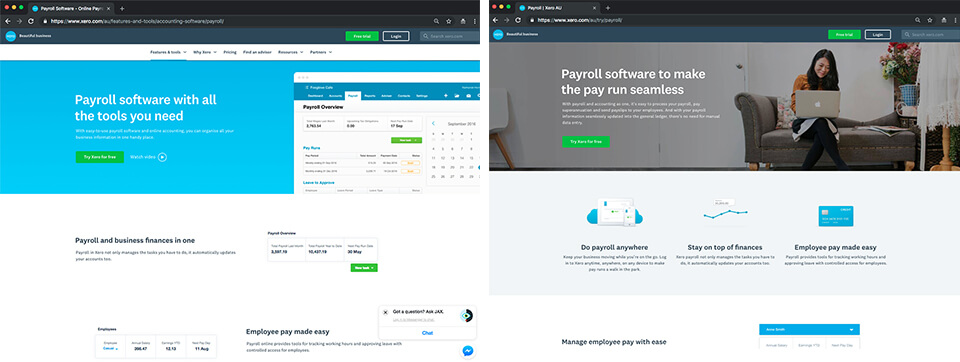
Xero have aligned the keywords from their paid search campaigns with their primary organic search campaigns. In comparing their payroll landing page copy to their payroll service page copy, the same keywords reoccur.
This means that the keywords for their landing pages and ads copy are being seamlessly used across their website organically, so there’s less of a disconnect between the two strategies and messaging is consistent for their audiences.
Optimisations
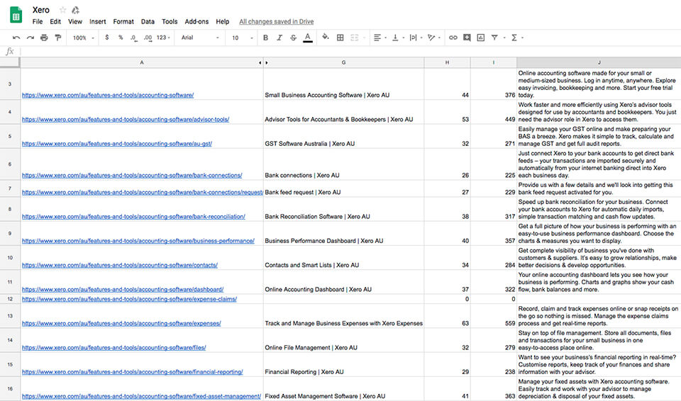
We used Screaming Frog SEO Spider to crawl the website and see if Xero have optimised their ‘Features and Tools’ pages’ title tags and meta descriptions – and no surprise, all pages are optimised for their purpose and for the users intent. See the full report here.
Meta tags are the first impression search engine crawlers get when crawling your content, and the title tag is the most important. For that reason, your primary keyword should be as close to your title tag as possible. Xero has included the primary keyword in the title tag (i.e page title) and they have followed best practice and kept their title tags to less than 70 characters.
The meta descriptions include the primary keywords and speak to the platform’s USPs, their ‘no fuss’ approach to accounting, and the benefits gained from the features and tools.
Rating Schema markup
Xero’s site structure and on-site SEO is generally very strong, however there is one way in which they can improve.
Schema markup provides more information to Google to tell them what specific sections of the website or page are about. Google then feeds this info back into the search results page so to enrich the search result and give the user more information, potentially increasing the chances of someone clicking through as well as being a ranking factor.
One of the biggest ones Xero could add is for reviews.
As Tam covered earlier, Xero was awarded a Canstar Blue award for having the most satisfied customers. They also have a number of reviews and testimonials on their site, so we know they get plenty of them. They also have a lot of reviews from industry and software publishers as you can see when you search for “Xero reviews”
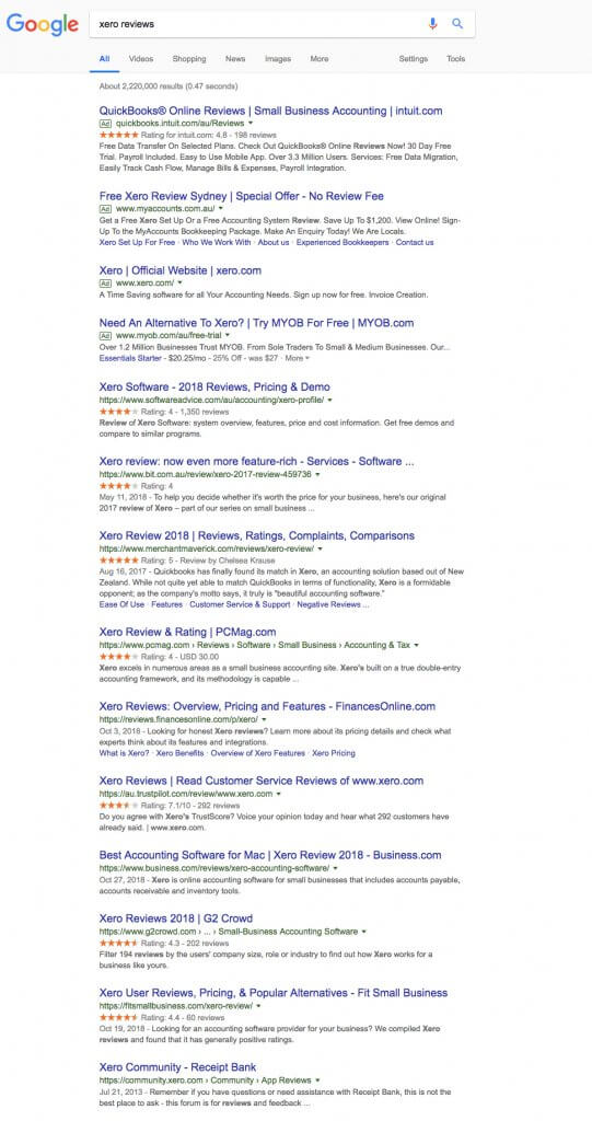
See the little star ratings under some of the search results? Those sites are using schema markup to bring their score into the search results, and Xero should be doing the same.
To do this, all Xero needs to do is implement a reviews snippet code onto their website (usually added into the footer) which tells Google the rating and number of reviews to display in the search results and where they came from.
Since Xero already has a lot of reviews on a range of platforms they can either choose one of the sites (such as Capterra where they have 1,366 reviews) and use this in the review snippets code and search results. Alternatively they can look at utilising an Aggregate Rating to take advantage of all of the reviews they have in different places.
Once they’ve added the code snippet to the site, Google will automatically pick this up and will then choose on what pages and when to show the reviews feature – when they do, it can have a big impact on organic click-through rate and rankings.
Generating and using positive reviews is a pretty big task that I could write a lot about but this isn’t the place for it. If you want to know more then check out this guide from our Head of Strategy & Growth, Duncan Jones.
Link Acquisition – backlinks, referring domains & domain ratings
Acquiring backlinks from high authority referring domains is a cornerstone of a strong SEO strategy. And Xero has had a link acquisition strategy in place from the get-go.
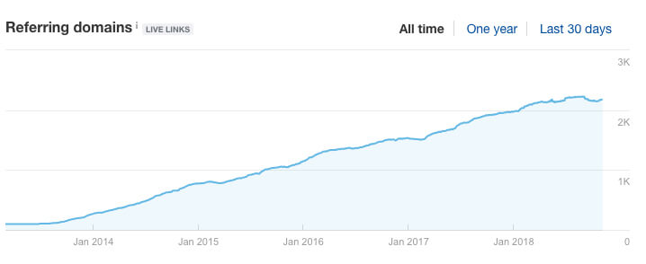
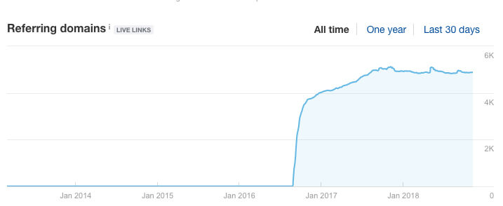
MYOB has been an accounting software provider for longer than Xero. Despite this, according to Ahrefs Xero has a higher domain authority. What we can conclude from this is that by comparing the cumulative referring domains over time, Xero launched with an active SEO strategy. It appears MYOB considered this as part of their digital strategy much later, which meant they fell behind in authority despite being active for longer.
This is why you need to consider SEO from the outset. It could be a gamechanger.
Xero

MYOB

Xero began by acquiring backlinks from accounting websites around 2014 and grew this approach in 2016 with bookkeepers.
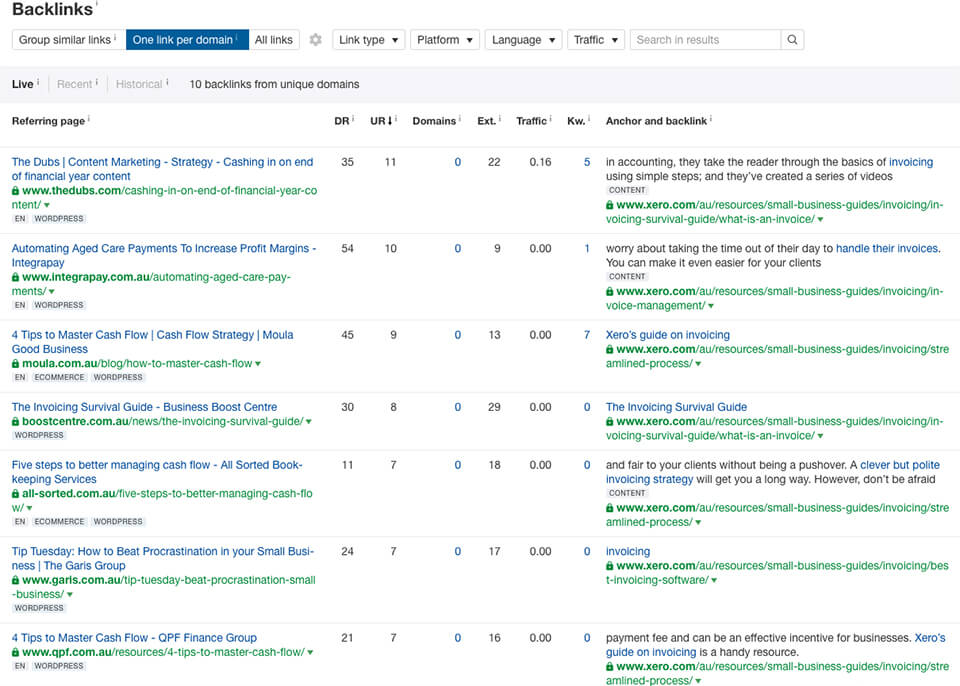
We took a good look at these backlinks and could see that these accountants and bookkeepers likely use the platform and may be in their Partner Program. While a good place to start, these referring domains have a relatively low value for Xero with domain ratings typically less than 30. Despite this, the value of Xero doing this in the beginning has been that they’re highly relevant as they come from websites within their industry, given a strong level of correlation between the backlinks and Xero’s domain.

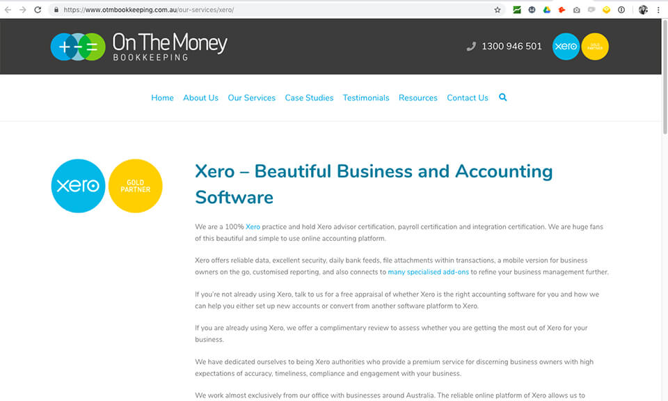
They achieved these links through a badge link acquisition strategy. The concept is straightforward – you design a badge to serve as a medallion of recognition. The badge functions as the link anchor when displayed on target sites, and should be relevant not only to your site but the sites that will actively and proudly display it.
This is an advanced growth link tactic used by SaaS providers like Xero to have their partners advertise that their brand is the preferred platform. This also provides their customers with the ability to advertise their level of investment in their platform i.e Gold Partners, Certified Agency, etc. And as a result of this strategy, accountants and bookkeepers have become brand advocates for Xero.
Depending on the size of the website that the badge is put on, it is common to have these in the footer of the website. The benefit of this is that you don’t only get the value of the referring domain, but it also includes a higher volume of backlinks because it’s on every page of the website.
In the beginning, this approach is really labour intensive because it requires people to be front facing, actively seeking new business relationships. The pay-off for Xero has been that once those relationships were built, they’ve been able to leverage the SEO focused strategy as well as build brand ambassadors.
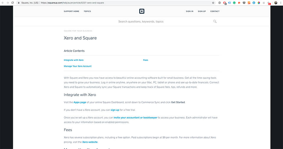
Xero has a huge marketplace of applications that users can connect with Xero. This has flowed into a predominant part of their backlinking profile, and we can see they’ve gained backlinks from other high-value sites through this approach. Each SaaS platform they integrate with typically has a dedicated content page featuring their relationship with Xero and linking back to key pages of their website.
To note, while this has been a great SEO strategy, it has also formed a strong role in their growth as each page gives them exposure to another brand’s users and the opportunity to convert leads into trial users.
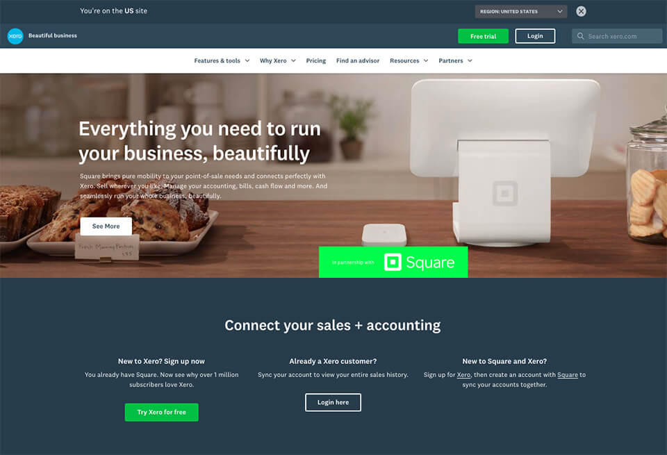
Take the following Xero+Square partnership, for instance – there are instructions not only on how to integrate with the platform, but a well-placed call-to-action on signing-up for Xero’s free trial by linking a dedicated partnership branded sign-up page.
This approach shows they understand the customer journey, and how to get good SEO and CRO from their partnerships.
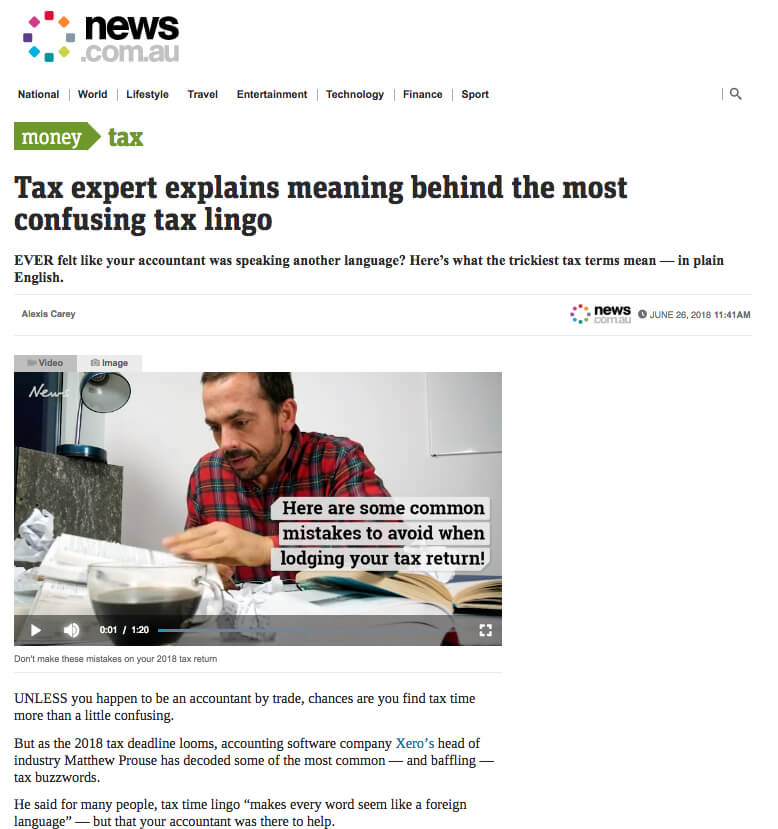
Over the last two years, Xero has ramped up their approach to backlinks, going after inbound links from high domain authority news publications with strong established audiences. They’ve done this through time-sensitive PR style link acquisition tactics, using relevant articles like this one on news.com.au talking about tax time and with media releases to tech sites like this one on techworld.com.au.
They have then scaled this approach by actively seeking opportunities to be thought leaders on specific topics with wide audience reach, allowing them to gain backlinks and build profiles on sites like these ones on Business Insider.

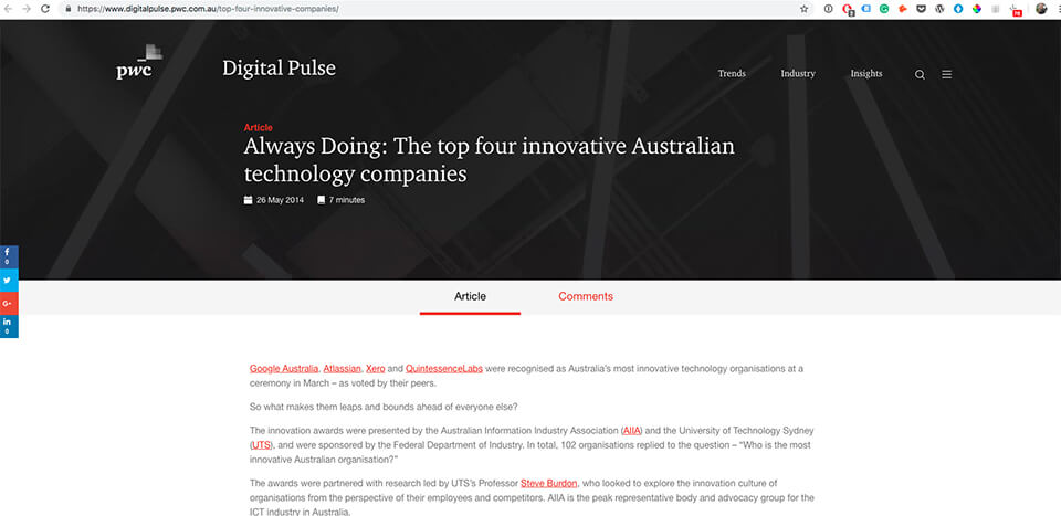
Finally, we can see that Xero is organically generating natural PR links through being an innovative and unique brand. Reputable brands – like pwc – are noticing their cut through in the marketplace and speaking about it. Though not something you can actively aim for, it helps that Xero is considered innovative in the tech industry. They’ve also won awards and been mentioned in lists like the AFR Fast 50 which helps raise their profile and makes others like PWC, Business Insider, and even Webprofits, want to talk about them.
Content Marketing
Xero has a solid content marketing strategy in place, creating truly global content that speaks to their target audiences at every stage of the customer journey.
As I’ve already discussed, Xero is using content to build links. But it also serves three other key purposes: to attract, to nurture, and to retain.
The following content areas highlight their varied approaches:
- Small Business Guides – Targets potential small business owners to increase brand awareness through search optimised content (i.e guides and checklists) that focuses on driving organic traffic from short to long tail search queries.
- Accountant/bookkeeper Guides – Targets accountants/bookkeepers to increase brand awareness through search optimised content (i.e guides and checklists) that focuses on driving organic traffic from short to long tail search queries.
- Accountant/Bookkeeper stories – Utilises narrative-style testimonials to speak to accountants and bookkeepers as they consider whether they should grow their practice with Xero.
- Training courses: Xero U – Looking to convert and retain customers, this education hub guides users on using the product through live course webinars offering training on Xero from their trial to add-ons.
- Xero TV – Used to both attract and retain, Xero TV forms the core of Xero’s video content strategy.
- Podcasts – Audio series featuring advice and stories from small business owners and industry experts.
- Blog – Features news about the platform and Xero’s partners, as well as product information and updates for customers.
- Small business insights – This is a data and report segment of the site, using content to build the brand’s reputation through offering insights and economic analysis that can be easily linked to, quoted, and shared by media and industry experts.
Attracting small business owners
Xero has a lot of content, but I’ll be looking at the “Small Business Guides” content strategy as this is the predominant approach they’ve used to attract small business owners.
The “Small Business Guides” offer tips and tricks for small business owners from ‘invoicing tips for beginners’ to ‘how to hire a bookkeeper’ and ‘understanding cloud computing’.
By creating valuable content that is keyword focused, Xero has been able to rank for highly competitive keywords and drive organic traffic to their website.
This top of the funnel style content performs an important purpose: to educate and warm these colder audiences, in turn, building brand awareness and trust.
So, what’s their approach and is it working?
Xero has created articles and in-depth guides around each of their services (invoicing, accounting, bookkeeping, marketing, business management, payroll, and so on) to improve their visibility in search and give link juice to each of their service and feature pages.
These categories form “content pillars”.
Pillar Content is a strategy designed to improve traffic and keyword rankings for important keywords. This type of content is a large, highly valuable piece that is linked to by smaller pieces of content on the blog, known as cluster content.
The goal is to have several pillars on the blog, each targeting a specific keyword cluster. Each relevant piece of cluster content will also link back to the main page, and this internal linking structure will help rank the content in SERPs.
Generating external links to the main pillar page through guest posts will further assist with this.
Xero has a killer pillar strategy for “invoicing”, which has helped them achieve their strong keyword rankings for invoicing (positions #1 and #2 on page 1 of Google – see above) and drive organic traffic in this highly competitive space.
At the core of their invoicing pillar strategy is the “Invoicing Survival Guide”, which explains how invoicing works from start to finish.
They have a large cluster of invoicing articles which target long-tail search queries such as “Invoice format tips for beginners”. These cluster articles link back to the guide, invoice template, other cluster articles, and invoicing service pages.

A large resource like this “Invoicing Survival Guide” is a good way of acquiring backlinks, as sites will naturally link back to valuable content.
Many companies make the tradeoff of gating valuable resources like this in order to capture email addresses – subsequently completely missing out on the SEO benefits. For companies more focused on building email lists, this could be the right strategy for them. But for Xero, using it for organic has paid off.
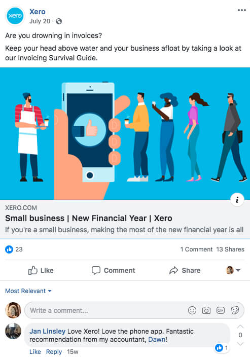
The Guide is also available as a pdf download, but Xero has still not utilised this opportunity to capture email addresses and nurture these potential customers through an automated email sequence. Rather, they are focused on social media engagement and remarketing.
Subsequently, Xero is promoting the guide on Facebook and sending people through to this nurture- and conversion-focused landing page.
Xero TV
The video content being produced for Xero TV is integral for the brand’s retention strategies. For existing customers and programme partners, the video library reflects the platform’s benefits and capabilities through support advice for SMBs and program partners.
This approach has enabled Xero to establish connections and nurture relationships with customers by helping them overcome business pain-points, and also retain them by shifting the conversation to product-centric content.
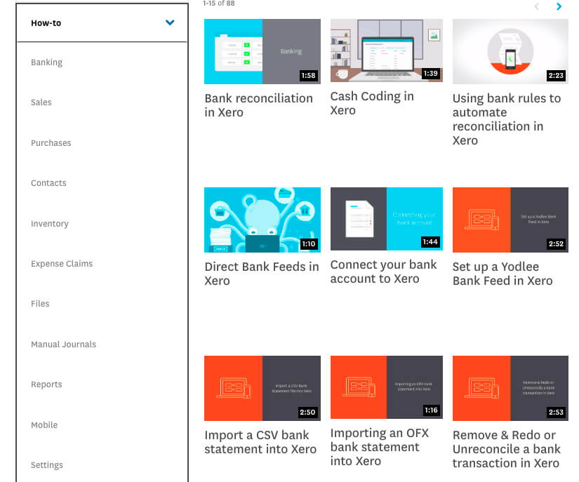
Here are some examples of the videos they share in the How-to category.
All of the videos share information on how to do a specific process within the platform, and the subcategories are broken down nicely so that it’s easy to find.
I would assume there was a significant time and cost investment on Xero’s part in order to create all of these videos, but the benefits would far outweigh it. The videos are the first step in a user troubleshooting when they can’t figure out how to do something on the platform. The more they can educate themselves, the less frustrated they will be, and the less frustrated they are, the less likely they are to churn and go with another provider.
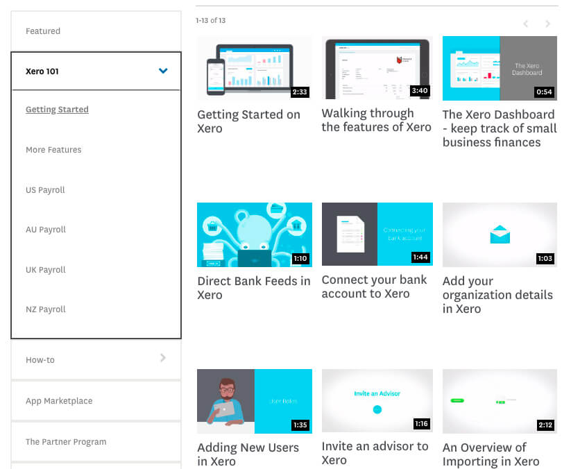
They even have a Xero 101 section for first time users to be able to set everything up without any problems. That way, the relationship is frictionless from the start and they have a satisfied customer from day one.
Using the data from video
Xero has an active and often-updated YouTube channel (which Dan will cover later in this article), so why have a platform dedicated to video on their website? Well, this plays into a larger, more complex marketing strategy: understanding every stage of the customer journey and timing their messaging accordingly.
From the moment a user starts watching a video on their site, the Xero marketing team uses Marketo and Brightcove to track how long their watch, where they drop off, and what actions they take next.
Sounds simple, right? But it’s what Xero can do with this information that matters.
Equipped with this knowledge, they can use this to understand the customer journey, from awareness through to conversion and retention. They can use this data to spark the next conversation and create content that speaks to users on social, or with a new video-centric landing page, or another sales outreach campaign. They can also tweak their existing content campaigns, onboarding sequences, and automated newsletters to create frictionless journeys.
Xero has formed an intrinsic relationship between content and business results, and shown that video can be a strong driver of key performance metrics (brand awareness, impressions, engagement, leads and sales).
By putting the customer at the centre of your content, you can both attract and retain a network of users. Look to speak to your audience and collect as much valuable data that provides insights into your customers’ journey, so you can hone your marketing strategy across their preferred channels.
Social
Xero is across a variety of platforms for many different reasons. They seem to understand that every social space requires a different approach to content, rather than just reposting the same content on every different account they have. The following accounts were audited in the order in which they are used the most: Facebook, LinkedIn and Instagram. With each different platform, an approach unique to that platform’s offering is taken – resulting in what I would call a comprehensive Social Media strategy.
Facebook (organic)
First, let’s talk about the organic aspects of their Facebook campaigns. Xero has taken multiple approaches to reach its audience organically. They regularly post to their page, have a community management strategy in place, organise regular Facebook Events, and even dabble in some Community Group strategies.
Posting & Community Management
Xero is posting content on the page about every 1-3 days, with content types including video, event promotion, and blog content. Honestly, the content is nothing to write home about and seems to only be posted to keep up the appearance of an active page.
The presence of ow.ly links tells me they have been using Hootsuite to schedule and post their content. This is a great way to keep your page populated with content, especially if you don’t plan on promoting and actually leveraging that content to grow your business. Could it be a more engaging and thought out strategy? Sure. But would I ever recommend a client of mine focus resources on organic Facebook page posts as a way to drive growth? No way.
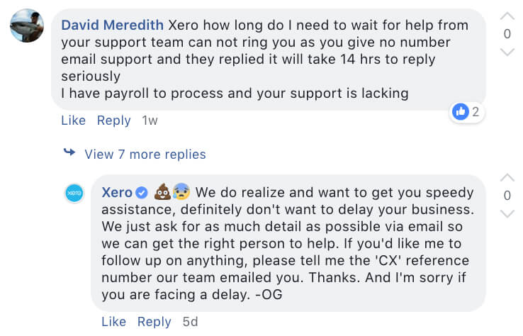
Since the posts don’t seem to be promoted in any way, the engagement numbers aren’t what I would call an adequate amount to really drive growth. However, it gives users a space to make comments, resulting in some (sometimes pretty intense, sometimes pretty funny) customer service inquiries and responses. Their response time is quick, which usually indicates they have a dedicated team to respond to social community inquiries, something we would always recommend including in your strategy.
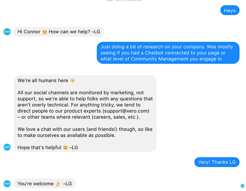
I double-checked their Messenger presence to see if they have a Chatbot strategy in place and, just like their commenting, it would seem they have someone dedicated to answer those messages as fast as possible (they answered me in less than 1 minute). This is great if you have the resources available, but I’d always recommend having some kind of automated response sequence to filter out the users that can answer their own questions by following a prompt.
Facebook Events
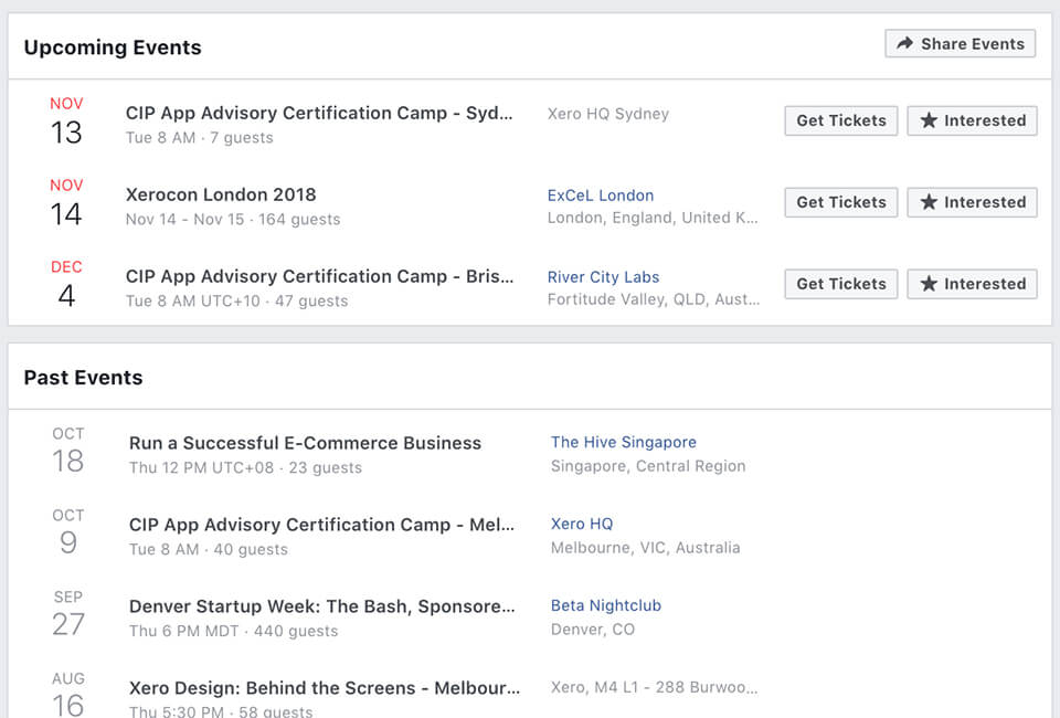
Xero, being a pretty large company, will obviously be hosting events around the world. And the great thing about their Facebook presence is they make it known. It would seem that every event offered to the public is included as a standalone event on Facebook.
This really gives people a sense that the company is making moves. It’s also an incredibly powerful aspect of organic reach these days, as “Interested” user actions to the events will show up on their friend and family News Feeds (for free!).
(We’ll cover the events themselves in more detail later in the article).
BONUS: Get in touch to learn more about our Paid Traffic Audit. Our team of world class paid media consultants will crunch the numbers, analyse the data and dig into the results of your Facebook Ads account to ensure your money is being spent wisely.
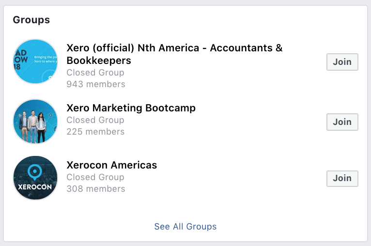
Facebook Community Groups
Now that organic reach (on Facebook) is basically dead, Facebook’s brand-owned Community Groups are one way for brands to reach their audiences for free.
While I wasn’t able to gain access to the groups themselves, I can tell this is a strategy they are exploring. The groups are closed and seem to be on an invite-only basis.
While it’s nice that they are exploring the value of these kinds of groups, if I was speaking directly to them as a consultant, I’d recommend finding a way to connect their core product with a solution-based sharing community.
Take one of the largest Community Groups – Facebook Ad Buyers. Tim Burd (a Facebook Marketing Guru) created a community where people like me can get together and discuss the latest and greatest about Facebook Ads and strategy.
It’s full of questions being answered, arguments and solutions, and every once in a while a sprinkle of sales focused marketing by Tim himself. This is the new organic when it comes to Facebook.
Some companies are ahead of the curve in creating and nurturing audiences through groups, but I believe it will get a lot bigger and that building an online community will be an important part of most successful business strategies in the not too distant future.
Facebook Ads
Alright. Now that we’ve taken a look at how they spend their time on Facebook, let’s look at how they spend their money. I could honestly write page after page on every region’s ads, but for now, let’s focus on Australia.
From what I can tell through Facebook’s “Info and Ads” sections, Xero is targeting multiple audiences with pretty different messages. The ad objectives range from converting prospects into customers, signing up for an Accounting event in Sydney, and listening to their podcast “First Year Frontiers.”
I’m going to break down their ads by a few key categories that I would segment my strategy by.
Content Type
Xero is using multiple ad formats including vertical and horizontal video, static imagery and even some animated “GIFs” (Thats pronounced Jifs, not Gifs btw). I like to see this in an ads strategy as, realistically, we really don’t know what will resonate best with our audience. Sure Facebook (and a lot of marketing channels) are always saying VIDEO IS KING. But honestly, I’ve run plenty of campaigns where static stock photography was the clear winner in a campaign.
Basically, Xero does a good job of varying their ad formats to ensure it never gets boring.
Creative and Messaging
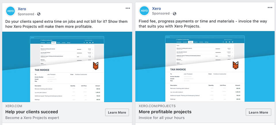
It’s very clear to me that Xero wants to come off as simple to use. Their messaging is very straight and to the point. No long headlines. No fancy paragraphs. Just short, easy to digest messaging that gets the main point across. This is a GREAT way to use a bit of subliminal messaging to represent your product when you’re in an industry that can seem pretty daunting to a new business owner. The words are simple. We are simple. Our product is simple. Easy.
Some example headlines they use:
- Satisfied? Satisfied.
- New to business?
- Helping small businesses thrive.
- Help your clients succeed.
- Track jobs on the go.
- A groundbreaking analysis.
This is also apparent in the creative for the ads. If it’s video, it’s quick and sometimes shot with an iPhone. If it’s branded imagery, they make sure to have the product as the main focal point, leaving the real work to the copy.
Campaigns
With the messaging of the different Ads I’m able to see, I can tell there are multiple campaigns set up to deliver to a variety of audiences. It’s clear they are targeting both new potential customers as well as spending ad budget targeting their existing customers.
Spending money reaching out to your customers is a really great strategy in my opinion. It keeps your clients involved, makes sure you remain top-of-mind, and keeps them invested in the idea of your product.
Here’s a breakdown of what I can tell is part of their funnel strategy.
COLD AUDIENCES (People that aren’t familiar with Xero)
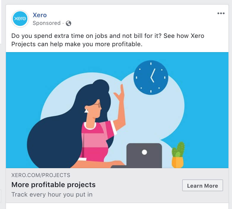
WARM AUDIENCES (People that are aware of Xero)
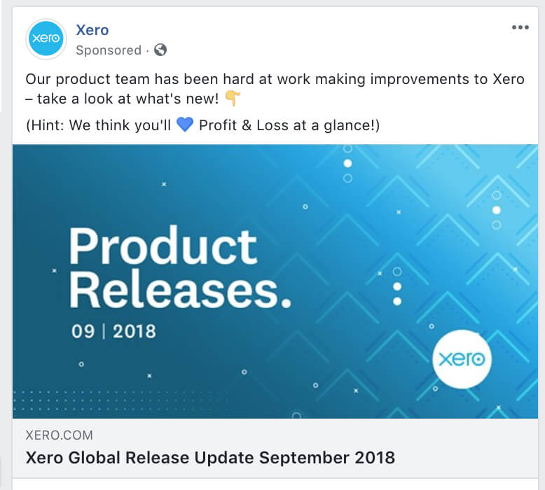

HOT AUDIENCES (Customers)

You can see from the above ads that the messaging is pretty different for each kind of audience I assume they are being delivered to.
With the “cold” audience ads, the messaging is problem- and solution-focused. How can our business help yours, what can we do for you, etc.
The “warm” audiences tend to showcase the brand a bit more, giving further insight into not only how reputable the company is but also how proactive in the industry they are. This gives users who are just starting to get to know Xero an interesting look at their efforts – a good use of social proof.
Once we get to the converted or “hot” audience ads, it’s all about the brand play. I don’t think Xero wants these ads to do anything other than keep their audience of customers happy, engaged, and thinking positively about Xero. Showcasing awards is always a safe bet in keeping that positive message in front of your clients, and I think the ads they’ve chosen to do so look great.
If I could only get a look into their ads account I’d be able to provide those reading this some real statistical data analysis … maybe one of their team will reach out when we publish this and I can do a follow up 😉
I’m just going to start out by saying I am absolutely in love with Xero’s IG strategy. They do an amazing job of utilising this platform for what it was truly made for.
They’ve just started posting IG Stories and IGTV episodes, but those strategies are in their infancy. I’m going to focus on their Organic Instagram Posts strategy. I’ll break down why I love it in three reasons:
1. It’s customer focused
- UGC or User Generated Content is one of the best ways to spread the message that your company is treating customers right. Xero has done an amazing job showcasing their happy customer stories.
- Not only do they showcase their happy customers, they tag them and essentially provide free promotion for each one’s business. This, to me, is essential in today’s digital climate. Nobody wants to feel like a customer. We’re all just partners digitally collaborating, right? That’s the feeling I get from this Instagram page. Advocating for your customers is just as important as them advocating for you, no matter what size your business is.
2. It’s simple
- Almost every single post is the exact same format, making their strategy easy to understand and digest. Anyone visiting the page will know exactly what they’re looking at from post to post.
- Each post contains a photo of their customer, a quote about the product, and some hashtags.
- This kind of strategy, once the bits and bobs are worked out, would easily be able to be actioned by an intern or part-timer. One of the hardest things about a creative strategy is finding a way to keep the ROI positive. I’d wager they don’t spend more than 10 minutes a day implementing this strategy, and it truly shines as a part of their digital campaign.
3. The content fits the platform
- One of the biggest mistakes a company can make on Instagram is to post the wrong kind of content. If we compare Xero’s FB vs IG content, you can see the obvious difference in imagery and tone of voice.
- “Branded Imagery” is not used on IG – some (even many of those on my own team) would argue this point with me but I truly believe branded or “designed” imagery has no place on an organic Instagram strategy (unless of course you are a graphic design team or similar). Xero simply posts photos of their customers. No overlayed text. No logo. It’s clean, gets its message across, and doesn’t interrupt a user’s experiences. Kudos, Xero.



I’m not going to focus much on LinkedIn in this article as, to be completely honest, their LinkedIn strategy from what I can tell is just a mirror of their Facebook posting strategy. No shame or harm in this kind of strategy, especially for an Accounting Software company.
I’d be willing to wager what works on Facebook would most likely work just as well if not better on LinkedIn. This would be one of the few times I’d suggest keeping the format and messaging similar across the platforms. The only thing to keep in mind here is that whatever you’re paying on Facebook, be ready to pay ~5X for the same results on LinkedIn.
I’m sure Xero are running Ads on LinkedIn. I’ve tried numerous times to get into their remarketing sequence on there but haven’t had any luck. If their ads strategy is anything like their Facebook Ads strategy, I’d say the messaging and imagery is pretty much still on point. If it were me, I’d run a few more highly targeted eBook or content pieces on LinkedIn to really grab those expensive users details so I’d have the opportunity to remarket to them on a cheaper platform later.
Twitter is a tough one these days. They’ve got a few problems that make it hard for marketers to execute a well-rounded strategy on the platform.
For one thing, it’s not visual at all. Unless you have a VERY bold statement that can be expressed through mostly text, you’re just not going to get the cut through you’re looking for.
I think Twitter is another one of Xero’s strategies where it’s updated regularly, customer and fan inquiries are taken care of promptly, but there just isn’t the opportunity there for them to justify investing a significant amount of resources to the platform. A good move in my eyes.
Social overview
Now that we’ve had a glimpse into what Xero is doing on Social, I can honestly say I think their team is killing it. They have their main focus areas taken care of, are delivering a constant stream of high-quality content AND they’re not afraid to begin testing out new areas of opportunity. They’re also smart enough to realise where their opportunities live and die, and adjust their resources accordingly.
If I could get in a room with them, I’d tell them their next main area of focus would be those tasty “Organic Facebook Community Groups.” With a following like theirs, and budget and traffic numbers, they could easily begin growing a community of small business owners to nurture and convert. This is by far the biggest growth opportunity in the game right now, so I suggest they jump on it before Facebook decides to diminish and monetise.
Community Marketing
Ever heard of community marketing? It’s a fairly new term that is getting traction within the marketing and business world as more businesses are looking at ways to keep their existing customers engage and increase referrals – and at the same time, build a stronger brand.
To refresh your memory, we wrote an article about everything community marketing a few months ago. Just some key stats about why Community marketing is important as part of your strategy:
- Happy customers tell an average of 9 people about their experience with a product/service.
- 14x more likely to sell to an existing customer rather than a new one.
- And even with a small retention rate of only 5%, it is going to look better for your bottom line with potential to lead to a 25-30% increase in profit.
Currently doing community marketing? Don’t worry, there are many companies that aren’t – or, many companies who don’t have the right strategy.
Know who is doing community marketing well? You guessed it… Xero. The company prides themselves on keeping their audience base engaged particularly around the “loyalty” stage of their funnel.
About Xero Community Portal
Xero has set up a community portal in order to centralise, build and connect Xero customers and partners, as well as other key stakeholders in the ecosystem, to be part of the conversation around platform features (technical help with APIs, etc), solve issues, and also swap ideas and tips.
The benefits of Community for Xero
Aside from the obvious benefits above with community marketing generally, Xero have created their community with two main goals in mind:
- Advocacy – They want their customers to BE THE EXPERTS. It’s clearly stated in their community guidelines. Would you most likely become the customer of a product or service by being told by the sales team, or someone who is an actual customer? Xero are putting the power in the hands of the customers’ and partners’ hands – they are building an army of brand advocates to help continue to build the Xero ecosystem. Not to mention this is a great UGC (User Generated Content) strategy.
- ‘Control’ through Listening & Feedback – What’s the biggest factor when growing your business? Actively listening straight from the horse’s mouth – customers! Building an active community is a great way to ‘control’ what customers and partners are saying about the platform, and Xero would be looking out for;
- Customer pain points
- Platform feature requests
- Platform troubleshooting.
- Reduced customer support resources – Customer-driven communities are a great way to reduce the required customer support from the IT or customer support team for Xero. New customers to Xero can get answers directly from those existing customers who can say, “I went through this experience as well, here’s the best way I fixed this”.
Real-time listening & being able to create an open space for customers and partners to share their experience is an effective way to “put out fires” and speed up innovation internally to satisfy customer demands.
Anything that is said in the community is then logged and passed onto the team.
How they maintain and organise their community
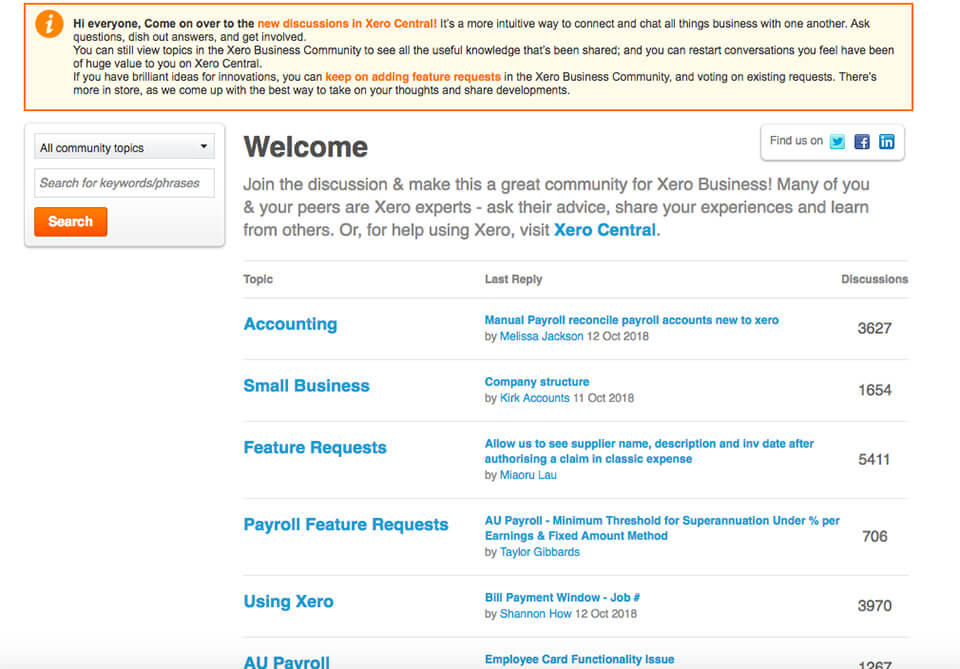
This image above is just part of one of 3 community pillars that is part of their community ecosystem. For the topic of “Accounting alone”, there are 3627 active discussions happening in just one thread – amazing. In conjunction with a search bar on the left hand side, finding answers and support from the community ensures existing customers and potential prospects know that there is an answer for effectively using the platform.
They structure their community into 3 main pillars based on expertise:
- Xero Business – General questions around accounting, small business, feature requests, App reviews, etc.
- Developer – Discussion for developers within the organisation around Xero’s API and 3rd party libraries/tools.
- Xero Central – Specific topics about using the Xero platform – this pillar is focused on solving direct customer issues quickly by the Xero team.
Key Takeaway: Building a strong community for your brand is not an easy task, but once you build an established community, the dividends will pay off. Your word-of-mouth will increase and improve the marketing effectiveness of your brand by 54%. It’s a no-brainer.
Event Marketing
About Xerocon
Xerocon is one the largest and most innovative Cloud-based global accounting conferences, having first launched in February 2010. The conference rotates across Australian capital cities and, for the past few years, the conference is also hosted in other parts of the world including London, UK and Atlanta, US.
Each conference has an average attendance of over 3,000 accountants and bookkeepers – there’s no wonder why Xero keep running annual conferences.


The benefits of running a conference are simple – they allow you to become the thought leader in the industry and connect directly with prospects and existing customers, tying in key sales and business objectives.
According to a recent report Event Marketing 2018: Benchmarks & Trends Report, it states that marketers (80%) attribute event marketing as one of the most important marketing channels contributing to their marketing funnel initiatives in B2B.
Why? Event marketing coincides with all parts of the funnel from awareness to loyalty stages.
How Xero is using Xerocon as part of their marketing strategy
How does Xero consistently market and fill out their conferences? How does Xero use it as part of their marketing strategy?
Xero has one overarching goal in mind – providing exceptional value. Xero makes the partner network and customers their number 1 priority.
The conference is shaped by Xero as a great centrepoint to connect all stakeholders together to foster new partnerships, share business objectives for ongoing client growth, and accounting best practices.
One purpose for running events comes down to customer psychology – Xero is making their audience work for them, without their customers and partners directly realising it.
When it comes to conferences, it’s about giving customers and partners that feeling of being the centre of attention which then enhances growth levers for all parties.
A conference is a perfect time for the internal teams to absorb as much information as possible to improve product features and experiences.
Xero run conferences around these 4 key objectives coinciding with all levels of the marketing funnel:
- Education – Inspire and educate existing and potential prospects around the latest updates in accounting technology by world-class speakers.
- Community-Building – Xerocon is the perfect opportunity to connect partner networks globally into one central location, fostering new partnership opportunities of companies who attend.
- Ecosystem Partners – It’s the best time to meet potential partners face-to-face. Customers can seek advisors and partners to help with their business objectives, especially around ongoing client growth.
- Promoting of the product – Is there any better way than announcing new product updates in front of approximately 3500 loyal partners/customers and potential new prospects?
Not only that, Xerocon is the perfect time for partners and customers to chat directly to Xero’s developer and product teams. Direct feedback through face-to-face conversationally in a scalable and practical manner means Xero can understand potential pain points and product requests in more detail, rather than getting customers to fill out surveys and support chat where extensive details can be missed. This promotes more loyal and advocacy within their funnel because Xero is taking the time to create a human connection, which in turn ensures customers are being heard (psychologically feel important) and have the necessary access to share their opinions with Xero and accounting practices.
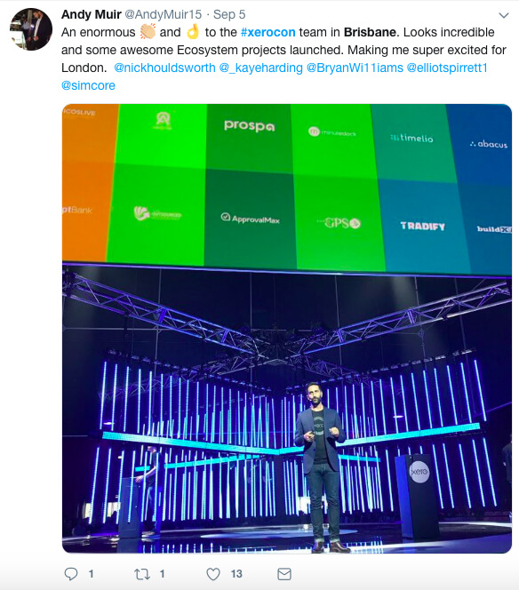
In order to achieve these 4 key objectives through event marketing, and to attract consistent audience attendances at every event location each year, Xero focuses on key characteristics of any amazing event by providing experiences that are built on each year.
- Speakers – World-class speakers who are cloud-accounting experts sharing the latest knowledge. As stated on their event website, they bring speakers who share their inspiring world’s to both business and personal life.
- Exhibition/Partners – The exhibition for participants is a key highlight of the multi-day conference. Illustrated above, connecting partners and customers within the network is where partnerships turn into fruition. The attendees love it.
- Xero Uni Day (Education) – Not only are attendees increasing their education of cloud-accounting practices and processes through headline speakers, but also through Xero’s ‘Uni-days’, which incorporate workshops and the opportunity to work with peers. This also provides another juncture for Xero’s internal team to assist and collect information around customer product behaviours in real-time.
Key Takeaway: Conferences such as Xerocon, or event marketing generally, are not always easy to execute and can be costly without a thorough strategy. However events – especially if a company is B2B – is a great idea to be a part of any marketing strategy as it touches on all areas of a marketing funnel.
Direct human connection with stakeholders and customers is key to directly communicate business messages and keep engagement high.
YouTube
It’s 2018, we all know that video marketing is important, but how many businesses are actually using it as a channel to help with their marketing funnel?
Video marketing is undoubtedly a great way for businesses to drive new customers throughout the awareness, consideration and conversion stage of the funnel. In addition, it can also drive retention and advocacy from existing customer bases.
However, there’s still a small percentage of businesses (even large successful businesses) in Australia who are producing great video content and actively engaging and growing their channel throughout the customer journey.
Why have a YouTube Channel & How Xero are using it
YouTube is a great marketing channel where companies can share stories, introduce products or services, and present product demonstrations. Xero are executing their YouTube and Video Content Strategy exceptionally well, producing high-quality, up-to-date and in-depth content through various categories.
The use of video is a great opportunity to engage new and existing customers which contributes to organic website visitors, sales and referrals.
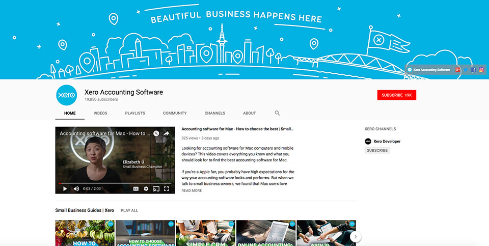
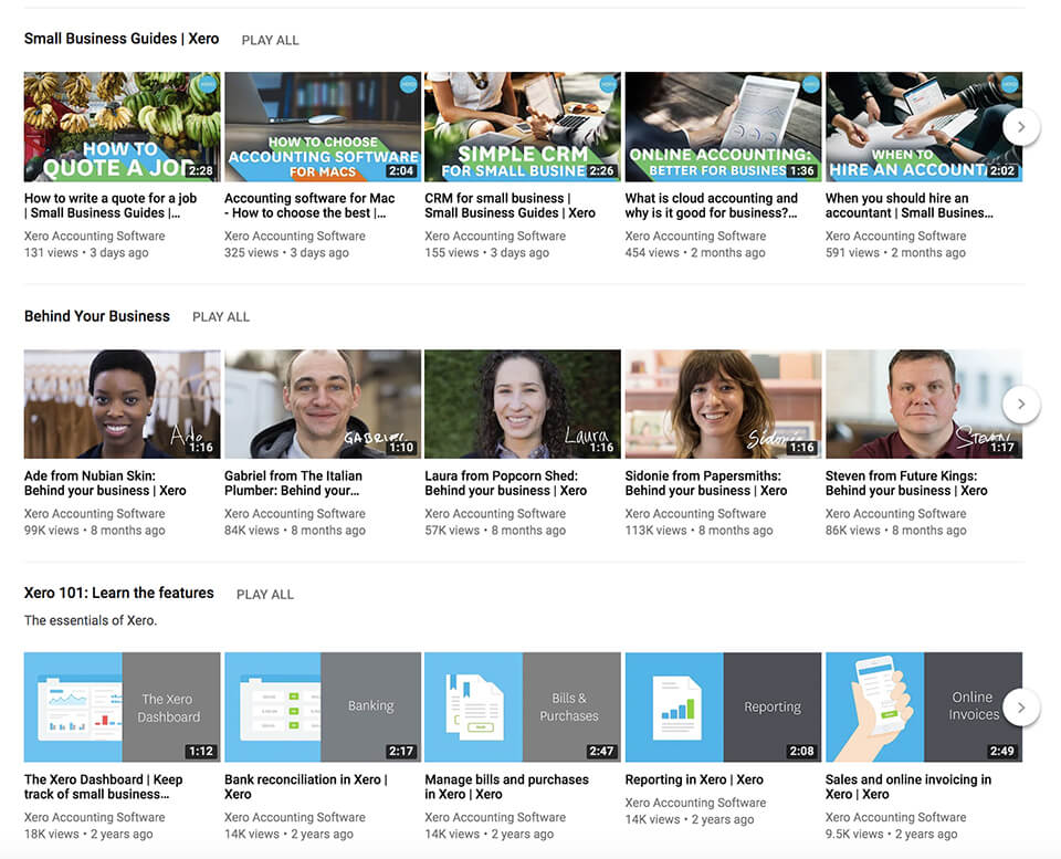
We can see Xero has used different types of video content pillars that fit into different parts of their marketing funnel, including:
- Small Business Guides(Awareness Stage) – Video content playlist which illustrates the benefits of cloud-based accounting, tutorial and explainer videos of general accounting topics.
- Behind your Business(Consideration Stage) – A “Behind the business” series that incorporates existing Xero customers and their stories of creating/starting their businesses, which ties in with specific features of Xero supporting their respective day-to-day business activities.
- Xero 101: Learn the features(Retention Stage) – Video playlist on the essential features of using the software – setup, bank reconciliation, reporting, invoicing, etc.
- Best Business Apps(Awareness/Consideration Stages) – A general video playlist around business apps which can help small businesses, interviewing real-world customers using various applications.
- The Advisors(Awareness Stage) – Highlighting the world of cloud-accounting from some of the top minds in the world.
- Customer stories(Consideration Stage) – Similar to the “Behind Your Business” series, further satisfied customer stories and testimonials of using Xero.
(Sub Heading) Factors that contribute to a successful YouTube Channel
Every YouTube channel has different success factors, however, the successful YouTube channels execute key factors within YouTube that contributes to the growth of their channel.
1. Metadata
Xero crafts their metadata in order to improve visibility potential of being discovered within the YouTube network by those who are on the platform looking at similar content.
Whilst there’s opportunity to include more keywords in their descriptions, Xero has used keywords relevant to reach their target audience. Also, they’ve structured their metadata well with short dialogue/key quotes from the video, using #behindyourbusiness campaign hashtag, link to the content series, calls-to-action, as well as additional links to their services.
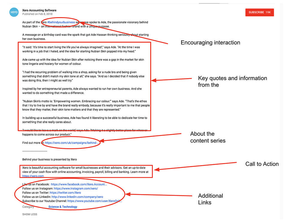
2. Well-crafted Video Headlines
Great use of video titles which are informative and to the point, which in turn improves click-through-rate.
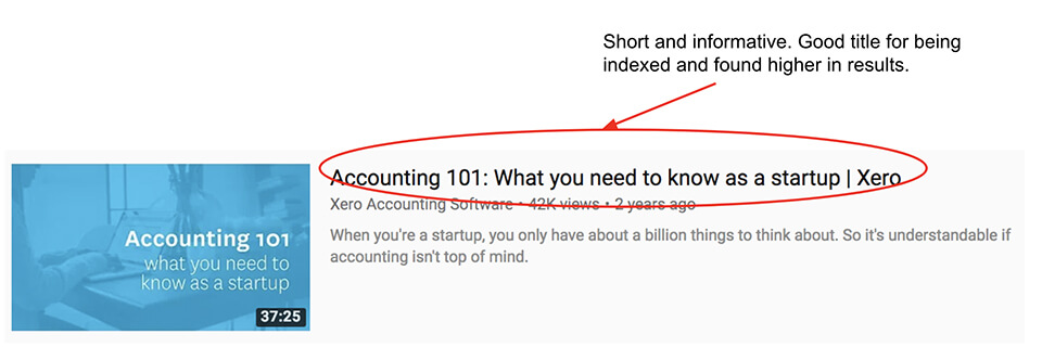
3. Video Thumbnails
Consistent, branded thumbnails across all video categories ensures YouTube viewers and prospect customers can see content easily and increase CTR.

Key Takeaway: Creating video content is one thing, but without a well-designed, categorised, metadata-rich and varied video content touching various stages of your marketing funnel, your YouTube channel will have less of a chance of performing or being found. Including key ingredients for your YouTube strategy, such as these three above, will ensure the best chance of YouTube growth success.
Final words
I’ve always been a fan of Xero but after delving deeper into how they market themselves my estimation of them has still increased significantly. It’s no surprise to me that they’ve disrupted the accounting software landscape and achieved such rapid growth.
Though we’ve covered a lot of channels and tactics, and picked out individual elements that are great or need work, I think an important thing to note is the holistic approach that Xero take.
Not only are they across a number of channels, and doing them well, they are also consistent with their messaging and approach throughout. Their commitment to being a simple, easy to use platform that puts the customer first shines through in a number of ways:
- Website copy and imagery highlights customers and focuses on simplicity
- Branding and marketing images are clear, clean and to the point
- Social media ads have very simple copy and headlines
- Email marketing onboarding process helps users get the most out of the platform
- Instagram posts hero their customer stories
- Content is created specifically to help existing customers
- Events educate but also welcome feedback for improvement
- They have built their own platform for their customers to become a community.
Every business is different, and every marketing strategy should be unique, so we’re not recommending that all companies should focus on being simple and customer centric.
What we’re highlighting is that Xero has understood exactly what it is that their audience love about them, and what makes them stand out from the competition who have been in business for a long time. They’ve then taken this understanding and applied it throughout their digital presence to ensure the message connects with their audience.
And that, in my opinion, is why they’ve been such a success story, and will continue to grow over the coming years.
BONUS: Take your marketing to the next level with a multi-channel growth strategy. Our team of channel specialists will create an industry-leading digital strategy that provides a roadmap for growth. Click here to find out what's included.
Disclaimer: We have no association with Xero or their founders (yet). This review has been completed using publicly available information on the internet. If you would like to get in touch with me, click here


